$200 Logo Contest

Collapse
X
 
  • Time
  • Show
Clear All
new posts
  • chrisg
    Registered User
    • Aug 2004
    • 20

    #1

    $200 Logo Contest

    I'd like to announce for everyone interested that I'll be needing a logo for an advertising agency.
    About company
    name: Redamo Studio
    translation: 'redamo' comes from latin meaning "to love back, to give love in return"
    main objective: provide customers with web advertising solutions (including SEO, banner campaigns, link popularity, e-mailing)
    secondary services: also providing internet presence, web design, identity, webhosting
    Terms
    contest will be held for about a week, might end sooner if I'll really like a logo;
    payment will be made by epassporte or by credit card;
    we reserve the rights not to announce any winner if we won't find a logo suitable; of course that we won't be using the logos resulting from this contest in that case and the copyright will be held by author till we will arrange the payment.
    If you agree with the above terms feel free to provide your entry(es) and address me any questions.
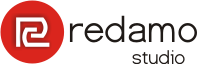
    This is the logo I made influenced by latin letters and mosaic from Pompeii:

    Good luck!
  • mind
    Confirmed User
    • Apr 2004
    • 1199

    #2
    this deserves a bumb - i'm in


    Would recommend setting a specific deadline - in my experiance no deadline contests dosent get the same amount of entries - entirely your choice though ;)

    MiND | ProDesignLab.com

    Comment

    • Young
      Bland for life
      • Nov 2004
      • 10468

      #3
      *cue the Paintbrush created image*

      hilarity ensues.
      ★★★

      Comment

      • mind
        Confirmed User
        • Apr 2004
        • 1199

        #4
        Originally posted by Young
        *cue the Paintbrush created image*

        hilarity ensues.
        uhm.. might be lost in translation..but huh?

        MiND | ProDesignLab.com

        Comment

        • sean416
          Confirmed User
          • Feb 2004
          • 3633

          #5
          Originally posted by mind
          uhm.. might be lost in translation..but huh?
          this is what he meant:

          *shitty image coming up*

          this is going to be funny.

          /translation.

          ServerProvider.com

          Comment

          • Platinumpimp
            Logos and such.
            • Jan 2004
            • 10214

            #6
            Wow a first post is immediately a content for somebody who registered 4 months ago. I don't see any deadline either.


            I design logo's.

            Comment

            • mind
              Confirmed User
              • Apr 2004
              • 1199

              #7
              Originally posted by PlatinumPimp
              Wow a first post is immediately a content for somebody who registered 4 months ago. I don't see any deadline either.


              Lol yeah a lot of designer hating going on these days - and yes hoping for a more specific deadline

              MiND | ProDesignLab.com

              Comment

              • chrisg
                Registered User
                • Aug 2004
                • 20

                #8
                I already specified that the contest will be held for about a week. If you need a more specific deadline here it is:
                December 15, 2004, 0:00 GMT

                Comment

                • mind
                  Confirmed User
                  • Apr 2004
                  • 1199

                  #9
                  Originally posted by chrisg
                  I already specified that the contest will be held for about a week. If you need a more specific deadline here it is:
                  December 15, 2004, 0:00 GMT
                  Bingo! there we have it - now lets get crackin'

                  MiND | ProDesignLab.com

                  Comment

                  • chrisg
                    Registered User
                    • Aug 2004
                    • 20

                    #10
                    I'll just hope that I'll have a few good entries to pick up from.

                    Comment

                    • Platinumpimp
                      Logos and such.
                      • Jan 2004
                      • 10214

                      #11
                      Lemme see here:

                      we reserve the rights not to announce any winner if we won't find a logo suitable; of course that we won't be using the logos resulting from this contest in that case and the copyright will be held by author till we will arrange the payment.

                      I mean thats like using a designer and tell him if I like your work I pay you.

                      I think I'll pass on this one.
                      I design logo's.

                      Comment

                      • TheFrog
                        Confirmed User
                        • Jan 2004
                        • 4095

                        #12
                        Originally posted by sean416
                        this is what he meant:

                        *shitty image coming up*

                        this is going to be funny.

                        /translation.

                        Comment

                        • xclusive
                          Too lazy to set a custom title
                          • Apr 2004
                          • 35218

                          #13
                          I'm working on one for you now i'll post it later...

                          I support MediumPimpin.com / Shemp's Outlawtgp.com /


                          Comment

                          • chrisg
                            Registered User
                            • Aug 2004
                            • 20

                            #14
                            Originally posted by PlatinumPimp
                            Lemme see here:

                            I mean thats like using a designer and tell him if I like your work I pay you.

                            I think I'll pass on this one.
                            Yes indeed, but that's what the contest are for. If there's a winner he will be paid of course. There're people that don't say that, there are even people that just steal others work. Just wanted to be onest. I'm just sick of those designers that charge an arm and a leg for a shitty logo. I made one myself and while asking people around me opinions they said that's better than the work provided by some designers. And I don't even dare to call myself a designer.
                            As for passing, that's your right to judge. Of course, first step in winning a competition is participating.

                            Comment

                            • mcmc
                              Confirmed User
                              • Feb 2004
                              • 1705

                              #15
                              Here's my entry. Olivetree because of the relation to the latin language ... such a tree is constantly growing and it lives almost forever.


                              cheers!
                              http://www.AdultDVDdb.com
                              Conversion: 1:149 (so far this year with more than 650 000 unique hits)
                              @ http://www.pimproll.com

                              Comment

                              • mcmc
                                Confirmed User
                                • Feb 2004
                                • 1705

                                #16
                                no other logos ?? .. c'mon everyone! let's have some fun!
                                http://www.AdultDVDdb.com
                                Conversion: 1:149 (so far this year with more than 650 000 unique hits)
                                @ http://www.pimproll.com

                                Comment

                                • mind
                                  Confirmed User
                                  • Apr 2004
                                  • 1199

                                  #17
                                  Originally posted by mcmc
                                  no other logos ?? .. c'mon everyone! let's have some fun!
                                  there will be

                                  MiND | ProDesignLab.com

                                  Comment

                                  • mind
                                    Confirmed User
                                    • Apr 2004
                                    • 1199

                                    #18
                                    Entry #1

                                    MiND | ProDesignLab.com

                                    Comment

                                    • mcmc
                                      Confirmed User
                                      • Feb 2004
                                      • 1705

                                      #19
                                      Originally posted by mind
                                      Entry #1
                                      nice one
                                      http://www.AdultDVDdb.com
                                      Conversion: 1:149 (so far this year with more than 650 000 unique hits)
                                      @ http://www.pimproll.com

                                      Comment

                                      • FrankHolland
                                        Confirmed User
                                        • Nov 2004
                                        • 7241

                                        #20
                                        damn, nice logos guys
                                        NastyDollars

                                        Comment

                                        • mcmc
                                          Confirmed User
                                          • Feb 2004
                                          • 1705

                                          #21
                                          Originally posted by FrankHolland
                                          damn, nice logos guys
                                          you said logoS ... so ... THX!
                                          http://www.AdultDVDdb.com
                                          Conversion: 1:149 (so far this year with more than 650 000 unique hits)
                                          @ http://www.pimproll.com

                                          Comment

                                          • pornpf69
                                            Too lazy to set a custom title
                                            • Jun 2004
                                            • 15782

                                            #22
                                            Originally posted by mcmc
                                            Here's my entry. Olivetree because of the relation to the latin language ... such a tree is constantly growing and it lives almost forever.


                                            cheers!
                                            awesome entry!! congrats!

                                            Comment

                                            • mcmc
                                              Confirmed User
                                              • Feb 2004
                                              • 1705

                                              #23
                                              Originally posted by pornpf69
                                              awesome entry!! congrats!
                                              thx!
                                              http://www.AdultDVDdb.com
                                              Conversion: 1:149 (so far this year with more than 650 000 unique hits)
                                              @ http://www.pimproll.com

                                              Comment

                                              • Sarma
                                                Confirmed User
                                                • Jun 2004
                                                • 715

                                                #24
                                                Originally posted by mind
                                                Entry #1
                                                I LIKE!
                                                I make up to $175 per sale, how about you? -> MoreNiche.com

                                                Comment

                                                • mind
                                                  Confirmed User
                                                  • Apr 2004
                                                  • 1199

                                                  #25
                                                  Originally posted by Sarma
                                                  I LIKE!
                                                  thanks

                                                  MiND | ProDesignLab.com

                                                  Comment

                                                  • skrog
                                                    Confirmed User
                                                    • Feb 2003
                                                    • 7230

                                                    #26


                                                    E-mail address: [email protected]

                                                    Btw, that cross is Latin.
                                                    Last edited by skrog; 12-07-2004, 04:02 PM.
                                                    banners, HTML5 banners, Bluray/DVD covers, full page ads, half page ads, headers, logos, 100% responsive galleries, SEO optimization, social media mgmt.
                                                    skype: skrogdotnet

                                                    Comment

                                                    • skrog
                                                      Confirmed User
                                                      • Feb 2003
                                                      • 7230

                                                      #27
                                                      Originally posted by mcmc
                                                      Here's my entry. Olivetree because of the relation to the latin language ... such a tree is constantly growing and it lives almost forever.


                                                      cheers!
                                                      niccccccccccccccccce
                                                      banners, HTML5 banners, Bluray/DVD covers, full page ads, half page ads, headers, logos, 100% responsive galleries, SEO optimization, social media mgmt.
                                                      skype: skrogdotnet

                                                      Comment

                                                      • skrog
                                                        Confirmed User
                                                        • Feb 2003
                                                        • 7230

                                                        #28
                                                        Originally posted by mind
                                                        Entry #1
                                                        Looks sliccccccccccccck
                                                        banners, HTML5 banners, Bluray/DVD covers, full page ads, half page ads, headers, logos, 100% responsive galleries, SEO optimization, social media mgmt.
                                                        skype: skrogdotnet

                                                        Comment

                                                        • mcmc
                                                          Confirmed User
                                                          • Feb 2004
                                                          • 1705

                                                          #29
                                                          damn. 3 logos so far. Thats not too good for a logo contest...
                                                          http://www.AdultDVDdb.com
                                                          Conversion: 1:149 (so far this year with more than 650 000 unique hits)
                                                          @ http://www.pimproll.com

                                                          Comment

                                                          • skrog
                                                            Confirmed User
                                                            • Feb 2003
                                                            • 7230

                                                            #30
                                                            Originally posted by mcmc
                                                            damn. 3 logos so far. Thats not too good for a logo contest...
                                                            It's all good.
                                                            banners, HTML5 banners, Bluray/DVD covers, full page ads, half page ads, headers, logos, 100% responsive galleries, SEO optimization, social media mgmt.
                                                            skype: skrogdotnet

                                                            Comment

                                                            • mcmc
                                                              Confirmed User
                                                              • Feb 2004
                                                              • 1705

                                                              #31
                                                              chris

                                                              why the latin letters and mosaic from Pompeii ? Are you from Italy?
                                                              http://www.AdultDVDdb.com
                                                              Conversion: 1:149 (so far this year with more than 650 000 unique hits)
                                                              @ http://www.pimproll.com

                                                              Comment

                                                              • skrog
                                                                Confirmed User
                                                                • Feb 2003
                                                                • 7230

                                                                #32
                                                                Bump!
                                                                banners, HTML5 banners, Bluray/DVD covers, full page ads, half page ads, headers, logos, 100% responsive galleries, SEO optimization, social media mgmt.
                                                                skype: skrogdotnet

                                                                Comment

                                                                • BuckLover
                                                                  Confirmed User
                                                                  • Feb 2003
                                                                  • 1656

                                                                  #33

                                                                  Comment

                                                                  • Platinumpimp
                                                                    Logos and such.
                                                                    • Jan 2004
                                                                    • 10214

                                                                    #34
                                                                    I design logo's.

                                                                    Comment

                                                                    • mind
                                                                      Confirmed User
                                                                      • Apr 2004
                                                                      • 1199

                                                                      #35
                                                                      Originally posted by PlatinumPimp
                                                                      welcome to the party Pimp ;) I see you changed your mind ;)

                                                                      MiND | ProDesignLab.com

                                                                      Comment

                                                                      • chrisg
                                                                        Registered User
                                                                        • Aug 2004
                                                                        • 20

                                                                        #36
                                                                        Originally posted by mcmc
                                                                        chris

                                                                        why the latin letters and mosaic from Pompeii ? Are you from Italy?
                                                                        My ancestors are ;) Anyway, the word is latin that's why I choose latin letters and the mosaic represens a labirinth.

                                                                        Anyway, nice entries guys. Here's another entry for me


                                                                        I might try a few colors and arrangement a bit.

                                                                        Thanks for the logos again and keep sending them.

                                                                        Comment

                                                                        • nosey
                                                                          Talk Hard
                                                                          • Feb 2003
                                                                          • 14413

                                                                          #37
                                                                          Originally posted by mcmc
                                                                          Here's my entry. Olivetree because of the relation to the latin language ... such a tree is constantly growing and it lives almost forever.


                                                                          cheers!
                                                                          nice

                                                                          | Domain whois privacy Free || GFY favored Hosting |
                                                                          $Chaturbate || FpcTraffic FPCPlugs || PlugRush Traffic

                                                                          Comment

                                                                          • chrisg
                                                                            Registered User
                                                                            • Aug 2004
                                                                            • 20

                                                                            #38
                                                                            Ah, and a few more things. Try not to sepparate red and amo, put them together, same line. Also, no other words beside "redamo" and "studio". You may add a graphic. What I'm looking for is a concept guys so when you add a logo please add a few words about what you have tried to represent.
                                                                            Thanks again!

                                                                            Comment

                                                                            • mcmc
                                                                              Confirmed User
                                                                              • Feb 2004
                                                                              • 1705

                                                                              #39
                                                                              Originally posted by chrisg
                                                                              My ancestors are ;) Anyway, the word is latin that's why I choose latin letters and the mosaic represens a labirinth.

                                                                              Anyway, nice entries guys. Here's another entry for me


                                                                              I might try a few colors and arrangement a bit.

                                                                              Thanks for the logos again and keep sending them.
                                                                              Da Vinci Style
                                                                              http://www.AdultDVDdb.com
                                                                              Conversion: 1:149 (so far this year with more than 650 000 unique hits)
                                                                              @ http://www.pimproll.com

                                                                              Comment

                                                                              • Platinumpimp
                                                                                Logos and such.
                                                                                • Jan 2004
                                                                                • 10214

                                                                                #40
                                                                                Originally posted by chrisg
                                                                                Ah, and a few more things. Try not to sepparate red and amo, put them together, same line. Also, no other words beside "redamo" and "studio". You may add a graphic. What I'm looking for is a concept guys so when you add a logo please add a few words about what you have tried to represent.
                                                                                Thanks again!
                                                                                Fair enough:

                                                                                My creation is basically based on the redamo meaning, "to love back, to give love in return". Love, together incooperated with a font that I think matches the whole concept along with some stars that he is trying to hold.

                                                                                I design logo's.

                                                                                Comment

                                                                                • mind
                                                                                  Confirmed User
                                                                                  • Apr 2004
                                                                                  • 1199

                                                                                  #41
                                                                                  Originally posted by mind
                                                                                  Entry #1
                                                                                  Well basically i was thinking about old latin and you mentioned pompeii and ruins came into my mind ;)


                                                                                  Another entry is in process though

                                                                                  MiND | ProDesignLab.com

                                                                                  Comment

                                                                                  • Olix
                                                                                    Confirmed User
                                                                                    • Oct 2004
                                                                                    • 492

                                                                                    #42
                                                                                    Originally posted by mind
                                                                                    Entry #1
                                                                                    Like the pilaar, but the font is crap.
                                                                                    # 589 092 179

                                                                                    Comment

                                                                                    • mind
                                                                                      Confirmed User
                                                                                      • Apr 2004
                                                                                      • 1199

                                                                                      #43
                                                                                      Originally posted by Olix
                                                                                      Like the pilaar, but the font is crap.
                                                                                      hm..yeah maybe your right.. gonna fiddle it abit mybe

                                                                                      MiND | ProDesignLab.com

                                                                                      Comment

                                                                                      • chrisg
                                                                                        Registered User
                                                                                        • Aug 2004
                                                                                        • 20

                                                                                        #44
                                                                                        I'll add a few more entries from me to allow for a fair judgment.
                                                                                        Also forgot to mention that all the graphic should be made vectorial to allow for rasterize printing.
                                                                                        My biggest problem is how to make connection between advertising and love.


                                                                                        Comment

                                                                                        • mind
                                                                                          Confirmed User
                                                                                          • Apr 2004
                                                                                          • 1199

                                                                                          #45
                                                                                          Originally posted by chrisg
                                                                                          I'll add a few more entries from me to allow for a fair judgment.
                                                                                          Also forgot to mention that all the graphic should be made vectorial to allow for rasterize printing.
                                                                                          My biggest problem is how to make connection between advertising and love.


                                                                                          yeah there is a slight danger that people will associate the logo with a dating site or valentines gift shop or something

                                                                                          MiND | ProDesignLab.com

                                                                                          Comment

                                                                                          • mind
                                                                                            Confirmed User
                                                                                            • Apr 2004
                                                                                            • 1199

                                                                                            #46
                                                                                            Here is another cupid type version and a very simple red rounded square with a classic "R" for redamo - just some different versions..


                                                                                            All my entries are full vektor

                                                                                            MiND | ProDesignLab.com

                                                                                            Comment

                                                                                            • kowntafit
                                                                                              Confirmed User
                                                                                              • Jan 2004
                                                                                              • 4667

                                                                                              #47
                                                                                              Some very nice entries, gonna be hard to choose.

                                                                                              This is where my next million is coming from!

                                                                                              Comment

                                                                                              • mind
                                                                                                Confirmed User
                                                                                                • Apr 2004
                                                                                                • 1199

                                                                                                #48
                                                                                                More detailed version of my cupid version


                                                                                                MiND | ProDesignLab.com

                                                                                                Comment

                                                                                                • chrisg
                                                                                                  Registered User
                                                                                                  • Aug 2004
                                                                                                  • 20

                                                                                                  #49
                                                                                                  Originally posted by mind
                                                                                                  yeah there is a slight danger that people will associate the logo with a dating site or valentines gift shop or something
                                                                                                  yep, exactly! maybe it's not to late to change mind about domain... kidding.
                                                                                                  now to provide a little feedback. I like the idea regarding olive tree provided by mcmc, maybe you should work a little about font. I also like the first one provided by mind but I won't like people to associate company with ruins . Also you should work a little about font as was also suggested. I also like the PlatinumPimp idea, the font is ok.
                                                                                                  To give you a direction let's also make another rule meaning not to sepparate red by amo as I also did. It's ok to emphasize a letter only (like first R) but not to induce the idea of sepparating red by amo. Again, thanks and keep up the good work coming.

                                                                                                  Comment

                                                                                                  • mind
                                                                                                    Confirmed User
                                                                                                    • Apr 2004
                                                                                                    • 1199

                                                                                                    #50
                                                                                                    Originally posted by chrisg
                                                                                                    I also like the first one provided by mind but I won't like people to associate company with ruins . Also you should work a little about font as was also suggested.
                                                                                                    Lol well think of it this way redamo are a pillar of stones that survived a volcano and are still around


                                                                                                    Anyways what about the cupid idead? too dating like?

                                                                                                    MiND | ProDesignLab.com

                                                                                                    Comment

                                                                                                    Working...