Critique Join Page Please

Collapse
X
 
  • Time
  • Show
Clear All
new posts
  • RazorSharpe
    Confirmed User
    • Aug 2001
    • 2238

    #1

    Critique Join Page Please

    I would really appreciate any critique, both good and bad about the following join page. I posted it in another thread yesterday but was hoping that it would get a bit more of a response if it was in it's own thread.


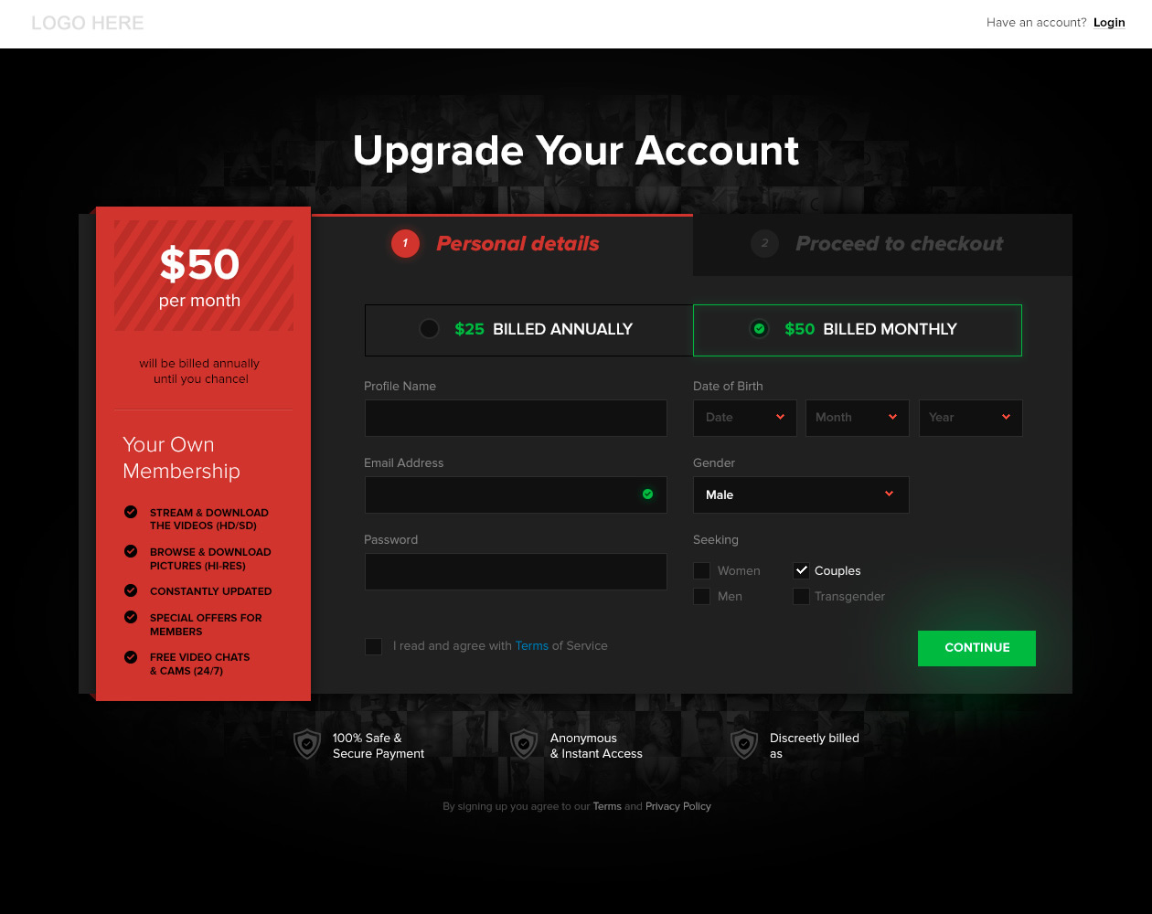
    You can click it to open to scale.

    A couple of people responded in the other thread and obviously this page will need to b tested against other variations but I was hoping to get some suggestions on how I could go about making this one better.

    For example, I prefer "Annual Subscription" to "Billed Annually" and this is something I'll test. Does anyone else have some sage advice on improving the page? Perhaps pointing out something I may have missed text-wise that could improve conversions?

    No critique is too harsh; I'm willing to take onboard everything people have to say.

    P.S.: As a reference, here is the other thread: http://gfy.com/showthread.php?t=1145883

    Thanks
    Programming today is a race between software engineers striving to build bigger and better idiot-proof programs, and the Universe trying to produce bigger and better idiots. So far, the Universe is winning.
  • Relentless
    www.EngineFood.com
    • Aug 2006
    • 5697

    #2
    Change that red block to light green. This is a 'happy, fun, safe and secure transaction where everyone can relax and enjoy complete peace of mind' and green or blue get that across visually.

    Red screams 'warning, are you sure about this, stop and think it over... Maybe look into it more and come back later if you are really sure you want to'
    Last edited by Relentless; 08-14-2014, 05:38 AM.


    Website Secure | Engine Food
    ICQ# 266-942-896

    Comment

    • Relentless
      www.EngineFood.com
      • Aug 2006
      • 5697

      #3
      I'd reword a lot of things differently and proof the text better.

      Things like 'until you chance' tell people this is not a professional site and it can't be trusted. Contact me via www.EngineFood.com if you want help with any of it.


      Website Secure | Engine Food
      ICQ# 266-942-896

      Comment

      • TeenCat
        Too lazy to set a koala
        • Jan 2007
        • 16139

        #4
        very nice i must say just not sure how you want to make the continue button that glowing?

        6bot
        / Coming again very soon!
        Svit Zlin Radio 24/7!

        Comment

        • RazorSharpe
          Confirmed User
          • Aug 2001
          • 2238

          #5
          Originally posted by Relentless
          Change that red block to light green. This is a 'happy, fun, safe and secure transaction where everyone can relax and enjoy complete peace of mind' and green or blue get that across visually.

          Red screams 'warning, are you sure about this, stop and think it over... Maybe look into it more and come back later if you are really sure you want to'
          Totally agree with you about the red and I swayed a fair bit over that sidebar. The thing is, the black and the red are the colours used on the rest of the site. Do you think it matters if this one page has a sidebar that is a different colour to the rest of the site?

          With regards to the text, this is just a mockup and unfortunately errors have crept in but we'll correct all spellings and grammar before pushing this one Joe Public.

          Thank you for taking the time to look it over, it is very appreciated.
          Programming today is a race between software engineers striving to build bigger and better idiot-proof programs, and the Universe trying to produce bigger and better idiots. So far, the Universe is winning.

          Comment

          • RazorSharpe
            Confirmed User
            • Aug 2001
            • 2238

            #6
            Originally posted by TeenCat
            very nice i must say just not sure how you want to make the continue button that glowing?
            Hi Teencat,

            Do you mean "how" or "why" we make that continue button glow?

            How = using CSS
            Why = We just felt it gave the page a little ompf but maybe it is distracting?
            Programming today is a race between software engineers striving to build bigger and better idiot-proof programs, and the Universe trying to produce bigger and better idiots. So far, the Universe is winning.

            Comment

            • TeenCat
              Too lazy to set a koala
              • Jan 2007
              • 16139

              #7
              Originally posted by RazorSharpe
              Hi Teencat,

              Do you mean "how" or "why" we make that continue button glow?

              How = using CSS
              Why = We just felt it gave the page a little ompf but maybe it is distracting?
              oh, css, thats great, havent seen it before i think, nice!

              6bot
              / Coming again very soon!
              Svit Zlin Radio 24/7!

              Comment

              • RazorSharpe
                Confirmed User
                • Aug 2001
                • 2238

                #8
                Originally posted by TeenCat
                oh, css, thats great, havent seen it before i think, nice!
                Hi Teencat,

                Here you go: http://zurb.com/playground/radioactive-buttons

                Of course, the button on my page won't flash like this
                Programming today is a race between software engineers striving to build bigger and better idiot-proof programs, and the Universe trying to produce bigger and better idiots. So far, the Universe is winning.

                Comment

                • The Porn Nerd
                  Living The Dream
                  • Jun 2009
                  • 19787

                  #9
                  Sorry to LOL at your Join page mate but OMG LOL.

                  First:

                  Get rid of the black. White background. Too dark, not easy to read, off-putting, yuck.

                  Also, you are struggling over the wording? Dude, go to a few Join pages from established companies/websites to get some 'inspiration'. Use words they use in much the same way. THEY have tested it and it works. Will it work for you tho? Only testing will tell but don't try to re-invent the wheel here.

                  Also, what Relentless said.
                  My Affiliate Programs:
                  Porn Nerd Cash | Porn Showcase | Aggressive Gold

                  Over 90 paysites to promote!
                  Now on Teams: peabodymedia

                  Comment

                  • JA$ON
                    Confirmed User
                    • Aug 2007
                    • 1329

                    #10
                    Originally posted by Relentless
                    Change that red block to light green. This is a 'happy, fun, safe and secure transaction where everyone can relax and enjoy complete peace of mind' and green or blue get that across visually.

                    Red screams 'warning, are you sure about this, stop and think it over... Maybe look into it more and come back later if you are really sure you want to'
                    You should NEVER make join forms red, Black or any other dark colors. People are sued to seeing White or very light color BG on CC pages they trust.

                    2c

                    Comment

                    • TeenCat
                      Too lazy to set a koala
                      • Jan 2007
                      • 16139

                      #11
                      Originally posted by RazorSharpe
                      Hi Teencat,

                      Here you go: http://zurb.com/playground/radioactive-buttons

                      Of course, the button on my page won't flash like this
                      oh, yeah, lol i see, i thought it will be possible by using some layer good

                      6bot
                      / Coming again very soon!
                      Svit Zlin Radio 24/7!

                      Comment

                      • RazorSharpe
                        Confirmed User
                        • Aug 2001
                        • 2238

                        #12
                        Originally posted by RazorSharpe
                        Totally agree with you about the red and I swayed a fair bit over that sidebar. The thing is, the black and the red are the colours used on the rest of the site. Do you think it matters if this one page has a sidebar that is a different colour to the rest of the site?

                        With regards to the text, this is just a mockup and unfortunately errors have crept in but we'll correct all spellings and grammar before pushing this one Joe Public.

                        Thank you for taking the time to look it over, it is very appreciated.
                        I did say I was open to criticism of all kinds, bad included, but damn! All's fair in love and war. Having said that, this is a pre-join page so it needed to come close to matching the rest of the site that uses those very colours. I will however run a test with that sidebar in a different colour(s) to see how that works.

                        I don't recall saying I was "struggling" for text, what I did saw was perhaps I missed some text that others usually use that would help conversions. I spent weeks trawling through sites looking for design inspirations as I'm fairly happy with this mockup. Is it perfect? Of course not. Could it be made better? I'm pretty sure it could; which is why I'm here asking what I may have inadvertently done right and what I've done wrong.

                        I'm aware that testing is the best way to prove a theory and I will be doing a lot of testing. It doesn't however hurt to ask for guidance or critiques even at the expense of someone going "yuck"

                        Having said that: http://erosexoticahd.com/join.html
                        That looks dark to me and has reds in it to boot. In fact, of the 3 pre joins pages of yours that I looked at, they all used black as the predominant colour. I'm not having a go at you or your sites, my questions are very genuine ... What is it about the black on my mockup that you don't like? Is it because it's teamed with the red sidebar? What was hard to read for you? I ask because I can sincerely not see anything that would be hard to read ... but it is possible I'm not because I've spent more time on this page than anyone else.

                        I appreciate you taking the time to have a look and give me your opinion TPN.
                        Programming today is a race between software engineers striving to build bigger and better idiot-proof programs, and the Universe trying to produce bigger and better idiots. So far, the Universe is winning.

                        Comment

                        • The Porn Nerd
                          Living The Dream
                          • Jun 2009
                          • 19787

                          #13
                          Originally posted by RazorSharpe
                          I did say I was open to criticism of all kinds, bad included, but damn! All's fair in love and war. Having said that, this is a pre-join page so it needed to come close to matching the rest of the site that uses those very colours. I will however run a test with that sidebar in a different colour(s) to see how that works.

                          I don't recall saying I was "struggling" for text, what I did saw was perhaps I missed some text that others usually use that would help conversions. I spent weeks trawling through sites looking for design inspirations as I'm fairly happy with this mockup. Is it perfect? Of course not. Could it be made better? I'm pretty sure it could; which is why I'm here asking what I may have inadvertently done right and what I've done wrong.

                          I'm aware that testing is the best way to prove a theory and I will be doing a lot of testing. It doesn't however hurt to ask for guidance or critiques even at the expense of someone going "yuck"

                          Having said that: http://erosexoticahd.com/join.html
                          That looks dark to me and has reds in it to boot. In fact, of the 3 pre joins pages of yours that I looked at, they all used black as the predominant colour. I'm not having a go at you or your sites, my questions are very genuine ... What is it about the black on my mockup that you don't like? Is it because it's teamed with the red sidebar? What was hard to read for you? I ask because I can sincerely not see anything that would be hard to read ... but it is possible I'm not because I've spent more time on this page than anyone else.

                          I appreciate you taking the time to have a look and give me your opinion TPN.
                          Ah ok, thanks for explaining further. It's hard to 'judge' a Join page on its' own without seeing the rest of the site, or from a screenshot.

                          I did not know this was a pre-join page. In THAT case integrating the design with the other tour pages is essential (again, did not see the other tour pages). So having the page be black is not bad in of itself.

                          With my pre-Join pages you see a lot of graphics. But my pre-Joins do not capture emails etc so mine have no data to enter. So what I meant by 'easier to read' was really 'easier to input data'. So making the fields in the form white would help.

                          As for using red etc: on my pages they are very graphic heavy so using red as contrast is fine. But any 'call to action' buttons are orange, not red (lookup color psychology for why) and most of the text is white. Sometimes I use a differant color for variety but generally most text is white. The idea is to not put any barriers to joining with graphics, text, fonts, colors, etc. It's a tricky thing. LOL

                          As for as the sidebar goes I would make it a lighter gray and do away with the red alrogether. Again, I would need to look at your site. The content itself will be the biggest aspect. The Join page (or pre-Join), when done right, will not STOP anyone from Joining. Will it HELP someone in joining? Well maybe putting some graphics on there and making it more of a 'sales page' might help but again, it depends on your site.
                          My Affiliate Programs:
                          Porn Nerd Cash | Porn Showcase | Aggressive Gold

                          Over 90 paysites to promote!
                          Now on Teams: peabodymedia

                          Comment

                          • mikesouth
                            Confirmed User
                            • Jun 2003
                            • 6334

                            #14
                            what others have said here your colors SCREAM, WARNING!
                            Mike South

                            It's No wonder I took up drugs and alcohol, it's the only way I could dumb myself down enough to cope with the morons in this biz.

                            Comment

                            • TrashyGirl
                              Confirmed User
                              • Apr 2010
                              • 1401

                              #15
                              Cancel is misspelled as Chancel.

                              Red is a huge psychological "stop" color. It is not a comfortable buying signal color.

                              Comment

                              • RazorSharpe
                                Confirmed User
                                • Aug 2001
                                • 2238

                                #16
                                Originally posted by mikesouth
                                what others have said here your colors SCREAM, WARNING!
                                Totally agree about the colour, in fact this is why I made the "continue" button a favourable colour but that is obviously not enough. I'll take this suggestion onboard and make that colour change to the sidebar.

                                Originally posted by TrashyGirl
                                Cancel is misspelled as Chancel.

                                Red is a huge psychological "stop" color. It is not a comfortable buying signal color.
                                Noted about the colour. Regarding the spelling errors, this is currently all dummy text. The end text will be proofed before we deploy though.

                                Thanks to both for input, appreciate it.
                                Programming today is a race between software engineers striving to build bigger and better idiot-proof programs, and the Universe trying to produce bigger and better idiots. So far, the Universe is winning.

                                Comment

                                • RazorSharpe
                                  Confirmed User
                                  • Aug 2001
                                  • 2238

                                  #17
                                  My mistake, I should have made it clear I was talking about a pre-join page.

                                  I like the idea of adding some images and I'll add that to my list of variations to test.

                                  I guess I always knew the red sidebar was an issue but I desperately wanted to keep the colour theme of the site going. I've made a note to test variations on colours for the sidebar.

                                  I'll post a link to other site pages when I've managed to get a few coded from their PSD states.

                                  Once again, appreciate you taking the time to weigh in. It's nice being able to get new ideas and also confirmation on things you feel may be wrong.

                                  Cheers ...

                                  Originally posted by The Porn Nerd
                                  Ah ok, thanks for explaining further. It's hard to 'judge' a Join page on its' own without seeing the rest of the site, or from a screenshot.

                                  I did not know this was a pre-join page. In THAT case integrating the design with the other tour pages is essential (again, did not see the other tour pages). So having the page be black is not bad in of itself.

                                  With my pre-Join pages you see a lot of graphics. But my pre-Joins do not capture emails etc so mine have no data to enter. So what I meant by 'easier to read' was really 'easier to input data'. So making the fields in the form white would help.

                                  As for using red etc: on my pages they are very graphic heavy so using red as contrast is fine. But any 'call to action' buttons are orange, not red (lookup color psychology for why) and most of the text is white. Sometimes I use a differant color for variety but generally most text is white. The idea is to not put any barriers to joining with graphics, text, fonts, colors, etc. It's a tricky thing. LOL

                                  As for as the sidebar goes I would make it a lighter gray and do away with the red alrogether. Again, I would need to look at your site. The content itself will be the biggest aspect. The Join page (or pre-Join), when done right, will not STOP anyone from Joining. Will it HELP someone in joining? Well maybe putting some graphics on there and making it more of a 'sales page' might help but again, it depends on your site.
                                  Programming today is a race between software engineers striving to build bigger and better idiot-proof programs, and the Universe trying to produce bigger and better idiots. So far, the Universe is winning.

                                  Comment

                                  • The Porn Nerd
                                    Living The Dream
                                    • Jun 2009
                                    • 19787

                                    #18
                                    Originally posted by RazorSharpe
                                    My mistake, I should have made it clear I was talking about a pre-join page.

                                    I like the idea of adding some images and I'll add that to my list of variations to test.

                                    I guess I always knew the red sidebar was an issue but I desperately wanted to keep the colour theme of the site going. I've made a note to test variations on colours for the sidebar.

                                    I'll post a link to other site pages when I've managed to get a few coded from their PSD states.

                                    Once again, appreciate you taking the time to weigh in. It's nice being able to get new ideas and also confirmation on things you feel may be wrong.

                                    Cheers ...
                                    Cheers as well - and there is no 'wrong'. Only what works and what doesn't work. It's all about the cha-cha-ching!

                                    $$$$$$$
                                    My Affiliate Programs:
                                    Porn Nerd Cash | Porn Showcase | Aggressive Gold

                                    Over 90 paysites to promote!
                                    Now on Teams: peabodymedia

                                    Comment

                                    Working...