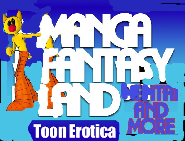
Is This Too big

Collapse
X
 
  • Time
  • Show
Clear All
new posts
  • Compdoctor
    Confirmed User
    • Aug 2001
    • 1937

    #1

    Is This Too big

    the logo I created?

    Content By Compdoctor- Original 3D Cartoon Work

    3D Comics

    Anime Resource Accepting Toon/Hentai Links
  • soulbleed
    Confirmed User
    • Oct 2005
    • 2606

    #2
    i think so. the character is cool, but i dont really like the font or they way the text is laid out

    Earn $20 per bottle of FREE penis enhancement pills you give away.
    Payments via Paypal, epassporte, check and wire.

    Comment

    • Voodoo
      ♥ ♦ ♣ ♠
      • Sep 2002
      • 10600

      #3
      Use just the head, and simple text next to it. You can use him elsewhere for further descriptors of whatever the site is about, like him holding his hand out to display an ad or text block, etc... But you want to keep your main logo simple and easy to read. It's great otherwise.

      "I'm selflessly supporting the common good, but only coincidentally looking out for No.1."

      Comment

      • Holly
        Too lazy to set a custom title
        • Jun 2003
        • 10017

        #4
        The whole thing is a mess. Too big, font is fucked up, layers are crazy. And apparently he's mastered the art of levitation.

        That's not a logo. It's an hpa. That no one can read.
        War National Damn Champions Eagle

        Comment

        • Steve Awesome
          Confirmed User
          • Jan 2007
          • 1575

          #5
          The words are far too obscured. Arrangement is everything. Here is a very rough re-arrangement to where it's at least usable enough to read.

          Comment

          • CashGordon
            at your service
            • Apr 2003
            • 1201

            #6
            It is cool but hard to read, you must put more spacing between characters


            SEXTRONIX | DATETRONIX | HENTAIBIZ | PIMPBOSS | GAYTRONIX
            icq#306500802 cashgordon||at||sextronix.com

            Comment

            • bobby666
              boots are my religion
              • Nov 2005
              • 21765

              #7
              the font hurts my eyes but the toon is great

              Comment

              • TeenCat
                Too lazy to set a koala
                • Jan 2007
                • 16131

                #8
                hey man how long are you doing design? logo can be big or small, depends on how you scale it lol

                6bot
                / Coming again very soon!
                Svit Zlin Radio 24/7!

                Comment

                • Sarah_Jayne
                  Now with more Jayne
                  • Dec 2002
                  • 40077

                  #9
                  It feels to cluttered for me.

                  Comment

                  • u-Bob
                    there's no $$$ in porn
                    • Jul 2005
                    • 33063

                    #10
                    too hard to read imho.

                    Comment

                    • Cyndalie
                      Confirmed User
                      • Jan 2002
                      • 3615

                      #11
                      I agree, hard to read, too large/bulky
                      Cyndalie
                      Marketing Director
                      StoriesTraffic.com

                      Comment

                      • zeruel
                        Confirmed User
                        • Apr 2007
                        • 1387

                        #12
                        that was nice... cool colors... if its a logo, it was too big... :D

                        Comment

                        • g$$$
                          Confirmed User
                          • Mar 2007
                          • 2807

                          #13
                          hard to read....steve awesome has the right idea....
                          Promote the best!

                          adult dating -
                          www.fling.com
                          www.hugetraffic.com


                          cams -
                          naked.com


                          icq: 369-270-399 - hit me up for special payouts

                          Comment

                          • nikooo
                            Confirmed User
                            • Apr 2007
                            • 1199

                            #14
                            just the make the words more readable...by experimenting with some more fonts..

                            ----- Blog Themes for $49 -----
                            ------ INSTANT DELIVERY ------

                            Comment

                            Working...