





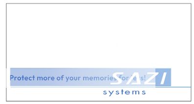

Originally posted by Quatermain One basic design. Different alterations show the versatility of this design.
Entries are built in Scalable Vector Graphics (SVG).
SVG provides precise structural, visual control, and infinite scaling without loss of crispness or quality.
Because SVG is an xml based graphics file format, any edits are dead simple. A custom Sazi SVG font is included.
it provides everything but good looks
they look nasty from a design point of view
that will not attract peoples attention, nor stay in their mind after they have left you site
it provides everything but good looks
they look nasty from a design point of view
that will not attract peoples attention, nor stay in their mind after they have left you site
Keep tossing out your professional design advice like a
drunken Bacchus with a perpetual hard-on for a
sceptre.
FYI: The above logo isn't meant to hold a web surfers attention. That is the job of the web sites content. The logo is intended for a mainstream company for across the spectrum use on things like letterhead, business cards, etc.
Originally posted by PlayGirl ...I'd also like to be able to resize it big enough for print and small enough to be an icon without distortion or loss of clarity...
I got some feedback from the head of the company and they like the idea of this one. Speaking on concepts alone, this one could work really well with a little bit of tweaking. It just needs a little something more so that it stands out and doesn't look so bland.
What font did you use for the "S" in this logo? I like it because the concept is there, but to be honest, whatever you did with it makes it look like shit. You've got the right idea, but you need to work on developing it. (Either that or your design skills) I'd like to see variations of this.
This is headed in the right direction (according to Liz from Sazi). I personally like the FTV Girls logos on your site, but I guess that's not corporate eh? Lol.
Originally posted by SexxxyChat-T Alright, here are my submissions, with a few variations. If you have any questions about them- ICQ: 162847729
I am really digging the first one (with the blue circle). It's professional and eye catching at the same time. Good concept, good use of colors, and good overall look. As for the other ones, anyone can whip out their shapes tool and throw some text and a gradient on it.
it provides everything but good looks
they look nasty from a design point of view
that will not attract peoples attention, nor stay in their mind after they have left you site
You really have no clue. And you keep insulting other good logo's too, so let me say this: your entries suck dude/dudette.
I have with drawn my entry also and will apply it to another project.
I can come up with something allot better for this contest. It's funny though, a friend of mine also said she thought my first entry looked like a license plate. :/
Which clipart collection did you get this one from?
The design's an original, genius--and better than you can do, or your bosses wouldn't be whoring you out to find "different styles". They're looking for other designers because your own skills are inadequate, or haven't you figured that out yet? I can only imagine how much business the portfolio in your sig isn't generating for you. Quite the pro.
But look on the bright side, dumbfuck, you're letting all the other designers and potential clients reading this know that you're a shit-talking amateur and it's wise to avoid your threads. Good work, PlayGirl.
The design's an original, genius--and better than you can do, or your bosses wouldn't be whoring you out to find "different styles". They're looking for other designers because your own skills are inadequate, or haven't you figured that out yet? I can only imagine how much business the portfolio in your sig isn't generating for you. Quite the pro.
But look on the bright side, dumbfuck, you're letting all the other designers and potential clients reading this know that you're a shit-talking amateur and it's wise to avoid your threads. Good work, PlayGirl.
Originally posted by Funkito The design's an original, genius--and better than you can do, or your bosses wouldn't be whoring you out to find "different styles". They're looking for other designers because your own skills are inadequate, or haven't you figured that out yet? I can only imagine how much business the portfolio in your sig isn't generating for you. Quite the pro.
But look on the bright side, dumbfuck, you're letting all the other designers and potential clients reading this know that you're a shit-talking amateur and it's wise to avoid your threads. Good work, PlayGirl.
Hey guys, I apologize if anyone was offended by my comments. I didn't say those things to be a bitch or offend anyone. To put it lightly, I was simply being brutally honest.
Funkito, I never trashed your logo, it just looked like clipart to me. (Although I wouldn't say it was genius, I wouldn't say it was the best I've seen either). I'm sorry if you feel that I was shit-talking by telling the truth.
And I think anyone would agree that if they were paying for a logo they would rather see a variety of different styles from different people as opposed to one.
I also never said that my work was better than anyone else's. Some people like it, some don't. And if people want to avoid working with me because of the things I said, it would probably be better off because one thing I'm NOT is an ass kisser. If you can't appreciate honesty than it would be in your best interest to go elsewhere.
Don't worry, i'm fine with brutal honesty, i normally don't even do gfx, i just know how to barely use photoshop. but here's my submission (worth a shot )
Comment