Help alter simple code real quick

Collapse
X
 
  • Time
  • Show
Clear All
new posts
  • Teen Boys Milk
    So Fucking Banned
    • Feb 2015
    • 98

    #1

    Help alter simple code real quick

    I can pay you if you want but I cannot afford much. Better to trade. I will trade my services for the correct answer to this question.

    USING THIS CODE:

    Code:
    add_action( 'wp_ajax_multi_cat', 'ajax_action_multi_cat' );
    add_action( 'wp_ajax_nopriv_multi_cat', 'ajax_action_multi_cat' );
    if( !function_exists('ajax_action_multi_cat') ) {
    function ajax_action_multi_cat() {
    	$nonce = $_POST['nonce'];
        if ( ! wp_verify_nonce( $nonce, 'ajaxed-nonce' ) )
            die ( 'Nope!' );   
    		$data = $_POST;
    
    		$page = intval($data['page']);
    		$paged = ($page) ? $page : 1;
    		ob_start();
    		$query_args = array(
    			'paged' => $paged,
    			'post_type' => 'post',
    			'posts_per_page' => 150,
    			'tax_query' => array(
    				array(
    					'taxonomy' => $data['tax'],
    					'field' => 'id',
    					'terms' => $data['term']
    				)
    			),
    		);
    		$query = new WP_Query($query_args);
    		$response = '';
    		if ( $query->have_posts() ) {
    			while ($query->have_posts() ) {
    				$query->the_post();
    				ob_start();
    				get_template_part( 'content', 'multi_category' );
    				$response .= ob_get_clean();
    			}
    			wp_reset_postdata();
    		} else {
    			$response = 'fail';
    		}
    
    		echo $response ;
    		exit;
    }
    }
    
    if( !function_exists('wpsm_categorizator_shortcode') ) {
    function wpsm_categorizator_shortcode( $atts, $content = null ) {
    	
    	extract(shortcode_atts(array(
    			'tax' => 'category',
    			'exclude' => '',
    			'include' => '',
    			'col' => '3'
    		), $atts));
            
        $args = array(
        	'taxonomy'=> $tax,
            'orderby' => 'name',
    		'exclude' => explode(',', $exclude),
    		'include' => explode(',', $include),
        );
        $terms = get_terms($args );
    
    	ob_start(); 
        ?>
    
        <?php
            if ( ! empty( $terms ) && ! is_wp_error( $terms ) ) {
                if ($col == '4') {
                	echo '<div class="col_wrap_fourth">';
                }
                elseif ($col == '2') {
                	echo '<div class="col_wrap_two">';
                }  
                elseif ($col == '1') {
                	echo '<div class="alignleft multicatleft">';
                }                       
                else {echo '<div class="col_wrap_three">'; }
                $i = 1;
                foreach ($terms as $term) {
                    $query_args = array(
                        'post_type' => 'post',
                        'posts_per_page' => 150,
                        'tax_query' => array(
                            array(
                                'taxonomy' => $term->taxonomy,
                                'field' => 'id',
                                'terms' => $term->term_id
                            )
                        ),
                    );
    
                    $query = new WP_Query($query_args);
    
                    if ( $query->have_posts() ) :
                        ?>
    
                        <div id="directory-<?php echo $term->term_id; ?>" class="multi_cat col_item"
                             data-tax="<?php echo $term->taxonomy; ?>"
                             data-term="<?php echo $term->term_id; ?>">
                            <div class="multi_cat_header">
    							<div class="multi_cat_lable">
    								<?php echo $term->name; ?>
    							</div>
                            </div>
                            <div class="">
    
                                <?php while ($query->have_posts() ) :
                                    $query->the_post();
                                    get_template_part( 'content', 'multi_category' );
                                endwhile; wp_reset_postdata(); ?>
    
                            </div>
                            <div class="cat-pagination multi_cat_header clearfix">
    
                                <?php for ($j = 1, $max_count = $query->max_num_pages; $j<= $max_count;  $j++) : ?>
                                    <?php $active = ($j ===1) ? 'active' : '' ;?>
                                    <a class="styled <?php echo $active; ?>" data-paginated="<?php echo $j; ?>"><?php echo $j;?></a>
                                <?php endfor; ?>
    
                            </div>
                        </div>
    
                        <?php $i++;
                        
                    endif;
                }
                echo '</div>';
            }   
        ?>
    
    	<?php 
    	$output = ob_get_contents();
    	ob_end_clean();
    	return $output;
    }
    add_shortcode('wpsm_categorizator', 'wpsm_categorizator_shortcode');
    }

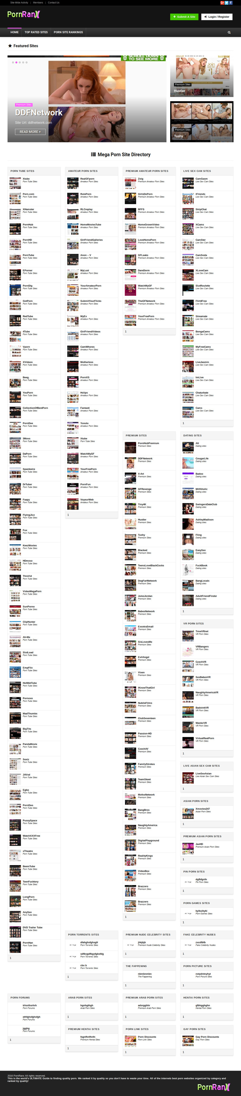
    ^^^^^^ that is a shortcode in my wordpress theme. It spawns category columns. I need to eliminate the VERTICAL spaces so the columns fit/interlock vertically with each other.

    SEE THIS PICTURE:


    you clearly see the vertical spaces I need those spaces gone. I know it can be done by altering the code I inserted above. Go to https://pornranx.com to see for yourself.

    MAYBE SOMEONE CAN BE NICE FOR ONCE IN THEIR LIFE AND JUST GIVE ME THE SOLUTION FOR A KISS AND A HUG?
  • tomash999
    Confirmed User
    • Sep 2015
    • 87

    #2
    What is the problem right now and how it should be?
    Can you put it in pastebin?

    I just can guess that you want to shorter it, but how exactly it should look like?

    Without looking too much into the code or the website, if it is a styling problem, add this to one of the columns:

    ````
    .multi_cat{
    /* put the right value here */
    max-height: 420px;
    overflow-y: scroll;
    }
    ````

    If this is a PHP problem, there query request if for 150 posts (in 2 places), reduce this number.

    Comment

    • Teen Boys Milk
      So Fucking Banned
      • Feb 2015
      • 98

      #3
      thanks but....

      thanks for attempting to help but i think you misunderstand the issue.


      I have only one issue, I simply want the eliminate the blank spaces. Right now each column set in static rows. So right now it is 4 columns per row and the row is static. I need each column to VERTICALLY link with the ones above. Look at my picture and code.

      Here I have created two quick illustrations:

      BEFORE(HERE IS WHAT IT LOOKS LIKE NOW):


      AFTER (HERE IS WHAT I WANT IT TO LOOK LIKE):


      SEE? The empty vertical space i want it gone, I want the columns tightly fit together.

      Please look at the code I posted in top of this thread and see if there is a line I can alter to make this happen.


      Thanks.

      Comment

      • Colmike9
        (>^_^)b
        • Dec 2011
        • 7217

        #4
        Looks more like a CSS issue than PHP, for example if I wanted to do that similar to a grid theme, I'd set CSS to float left plus a couple of other things depending how the DIVs are set up, probably needs clear or something like that.

        If you want, PM me the URL and I'll take a closer look.
        Edit: I missed the URL. Looking now.
        Join the BEST cam affiliate program on the internet!
        I've referred over $1.7mil in spending this past year, you should join in.
        I make a lot more money in the medical field in a lab now, fuck you guys. Don't ask me to come back, but do join Chaturbate in my sig, it still makes bank without me touching shit for years..

        Comment

        • danevans
          Confirmed User
          • Jun 2001
          • 1295

          #5
          in dcae4.css remove
          .col_wrap_fourth .col_item:nth-child(4n+1) {
          clear: both;
          }
          and it will be somewhat better, columns will flow depending on height, not be placed in rows.

          what you want is this, try playing:
          https://isotope.metafizzy.co/layout-modes/masonry.html
          Custom adult games / apps for your paysites.
          webmaster at multimoodia.net
          icq35291012

          Comment

          • Teen Boys Milk
            So Fucking Banned
            • Feb 2015
            • 98

            #6
            Thanks fellas.....

            Okay so after the one guy said "CSS" I was like yep your right. Here is the only CSS code related to the columns I need to change.

            Code:
            /* Categorizator */
            .col_item{ position: relative;}
            .col_wrap_two{margin: 0 -2.5% 20px; overflow: hidden;}
            .col_wrap_two .col_item {width: 45%; margin: 0 2.5% 30px; float: left;}
            .col_wrap_three{margin: 0 -1.5% 20px; overflow: hidden;}
            .col_wrap_three .col_item {width: 30.33%; margin: 0 1.5% 25px; float: left;}
            .col_wrap_three .col_item:nth-child(3n+1) { clear: both;}
            .col_wrap_two .col_item:nth-child(2n+1) { clear: both;}
            .col_wrap_fourth{margin: 0 -1% 15px; overflow: hidden;}
            .col_wrap_fifth, .col_wrap_six{margin: 0 -1% 15px; overflow: hidden;}
            .col_wrap_fourth .col_item {width: 23%; margin: 0 1% 25px; float: left;}
            .col_wrap_fourth .col_item:nth-child(4n+1) { clear: both;}
            .col_wrap_fifth .col_item {width: 18%; margin: 0 1% 25px; float: left;}
            .col_wrap_fifth .col_item:nth-child(5n+1) { clear: both;}
            .col_wrap_six .col_item {width: 15.26%; margin: 0 0.7% 25px; float: left;}
            .col_wrap_six .col_item:nth-child(6n+1) { clear: both;}
            .rh-flex-columns{display: -webkit-flex; -webkit-flex-wrap:wrap;-webkit-justify-content: space-between;display: -ms-flexbox; -ms-flex-wrap:wrap;-ms-justify-content: space-between;-ms-flex-pack: justify;display: flex; flex-wrap: wrap;justify-content: space-between; flex-direction: row; }
            .rh-flex-eq-height{display: -webkit-flex; -webkit-flex-wrap:wrap;display: -ms-flexbox; -ms-flex-wrap:wrap;display: flex; flex-wrap: wrap;flex-direction: row; }
            .rh-flex-eq-height .pagination, .rh-flex-eq-height .re_ajax_pagination, .rh-flex-eq-height .woocommerce-pagination{width: 100%;flex-basis: 100%;}
            .rh-flex-eq-height .re_ajax_pagination{margin: -1px; }
            .no_padding_wrap .col_wrap_three .col_item, .no_padding_wrap .col_wrap_fourth .col_item, .no_padding_wrap .col_wrap_fifth .col_item, .no_padding_wrap .col_wrap_six .col_item{margin: 0; box-shadow: none !important}
            .no_padding_wrap .col_wrap_three .col_item{width: 33.33%}
            .no_padding_wrap .col_wrap_fourth .col_item{width: 25%}
            .no_padding_wrap .col_wrap_fifth .col_item{width: 20%}
            .no_padding_wrap .col_wrap_six .col_item{width: 16.66%}
            @media (max-width: 1024px) and (min-width: 768px) {
            .col_wrap_fourth, .col_wrap_fifth, .col_wrap_six{margin: 0 -1.5% 20px; overflow: hidden;}
            .col_wrap_fourth .col_item, .col_wrap_fifth .col_item, .col_wrap_six .col_item {width: 30.33%; margin: 0 1.5% 15px; float: left;}
            .no_padding_wrap .col_wrap_fourth .col_item, .no_padding_wrap .col_wrap_fifth .col_item, .no_padding_wrap .col_wrap_six .col_item{width: 33%; margin: 0}
            .col_wrap_fourth .col_item:nth-child(3n+1), .col_wrap_fifth .col_item:nth-child(3n+1), .col_wrap_six .col_item:nth-child(3n+1){ clear: both;}
            .col_wrap_fourth .col_item:nth-child(4n+1), .col_wrap_fifth .col_item:nth-child(5n+1), .col_wrap_six .col_item:nth-child(6n+1) { clear: none;}
            }
            @media (max-width: 767px) {
            .col_wrap_two, .col_wrap_three, .col_wrap_fourth, .col_wrap_fifth, .col_wrap_six{margin: 0 0 20px 0;}
            .col_wrap_three .col_item, .col_wrap_fourth .col_item, .col_wrap_fifth .col_item, .col_wrap_six .col_item {width: 45%; margin: 0 2.5% 15px 2.5%;}
            .no_padding_wrap .col_wrap_three .col_item, .no_padding_wrap .col_wrap_fourth .col_item, .no_padding_wrap .col_wrap_fifth .col_item, .no_padding_wrap .col_wrap_six .col_item{width: 50%; margin: 0}
            .col_wrap_three .col_item:nth-child(3n+1), .col_wrap_fifth .col_item:nth-child(5n+1) { clear: none;}
            .col_wrap_three .col_item:nth-child(2n+1), .col_wrap_fourth .col_item:nth-child(2n+1), .col_wrap_fifth .col_item:nth-child(2n+1), .col_wrap_six .col_item:nth-child(2n+1) { clear: both;}
            }
            @media (max-width: 480px) {
            .col_wrap_three, .col_wrap_fourth, .col_wrap_two, .col_wrap_fifth, .col_wrap_six, .col_wrap_two {margin: 0 0 25px;}
            .col_item{width: 100% !important;}
            
            }
            .post_eq_grid{padding-top: 5px}
            .no_padding_wrap .eq_grid .col_item{border: 1px solid #eee; border-top: none; border-left: none}
            .no_padding_wrap .eq_grid{border: 1px solid #eee; border-right: none; border-bottom: none; padding: 0}
            .fourth-col-gridhub .multi_cat {width: 23%; margin: 0 1% 20px;}
            .multi_cat { background-color: #fff; border: 1px solid #E7E7E7; box-shadow: 0 4px 4px -2px rgba(0,0,0,0.1);   float: left; position: relative; }
            .multi_cat_wrap { position: relative; }
            .multi_cat_header { position: relative; background: #F5F5F5; width: 100%; border-bottom: 1px solid #E2E2E2; }
            .multi_cat_lable { display: inline-block; font-weight: 700; font-size: 13px; line-height: 14px; text-transform: uppercase; color: #333; position: relative; padding: 15px; letter-spacing: 0.5px }
            .multi_cat_lable span { margin-left: 0; margin-right: 7px; position: relative; top: 2px; }
            .category-icon { background-size: 16px 16px !important; background-color: #ccc; width: 16px; height: 16px; float: left; }
            .multi_cat_title { font-size: 13px; font-weight: bold; line-height: 16px }
            .multi_cat_title a { color: #111 !important; text-decoration: none !important; }
            .multi_cat .comm_meta { text-decoration: none !important;}
            .multi_cat_artical { padding: 10px; min-height: 61px; border-bottom: 1px solid #E7E7E7; overflow: hidden; }
            .multi_cat_wrap .multi_cat_artical:last-child { border: none; }
            .multi_cat_artical:hover { background-color: #F6F6F6; }
            .multi_cat_image { float: left; margin: 0 10px 0 0; }
            .cat-pagination { text-align: center; border-radius: 0px; margin: 0px; border-top: 1px solid #E2E2E2; overflow: hidden; padding: 0 5px;   }
            .cat-pagination a { display: block; float: left; cursor: pointer; font-size: 14px; font-weight: 500; text-align: center; min-width: 20px; line-height: 1em; padding: 9px 0px; color: #BABDD3 !important; text-decoration: none !important; }
            .cat-pagination a.active { color: #000000 !important; }
            .multi_cat_meta { margin-top: 5px; display: block; }
            .multi_cat .loading { opacity: .5; }
            .multi_cat .loading:after { content: "\f110"; position: absolute; top: 30px; left: 45%; font-size: 24px; opacity: 1; font-family: FontAwesome; -webkit-animation: fa-spin 1s linear infinite; -moz-animation: fa-spin 1s linear infinite; -o-animation: fa-spin 1s linear infinite; animation: fa-spin 1s linear infinite; }
            .categoriesbox { overflow: hidden;margin: 0 auto 15px auto !important; border: 1px solid #e0e0e0; transition: .2s; -webkit-transition: .2s; -moz-transition: .2s; -ms-transition: .2s; -o-transition: .2s; max-width: 300px; box-shadow: 0 2px 5px 0 rgba(0, 0, 0, 0.02), 0 2px 10px 0 rgba(0, 0, 0, 0.12);  background-color: #fff}
            .categoriesbox:hover { box-shadow: 0 2px 7px 0 rgba(0, 0, 0, 0.02), 0 5px 10px 0 rgba(0, 0, 0, 0.15); }
            .categoriesbox .categoriesbox-content { padding: 20px 20px;  }
            .categoriesbox h3 { margin: 0 0 12px 0; padding: 0; position: relative; }
            .categoriesbox:hover { transition: .2s; -webkit-transition: .2s; -moz-transition: .2s; -ms-transition: .2s; -o-transition: .2s }
            .categoriesbox h3 a { text-decoration: none; }
            .categoriesbox h3 a:after { content: "\f105"; font-family: FontAwesome; font-size: 20px; float: right; display: inline-block; padding-left: 8px; color: #555; line-height: 21px; transition: .2s; -webkit-transition: .2s; -moz-transition: .2s; -ms-transition: .2s; -o-transition: .2s }
            .categoriesbox:hover h3 a:after {padding-right: 5px }
            .categoriesbox .categoriesbox-content p { margin-bottom: 0; }
            .categoriesbox-bg { height: 175px; background-size: cover; -webkit-background-size: cover; background-position: center; background-repeat: no-repeat; position: relative; transition: .2s; -webkit-transition: .2s; -moz-transition: .2s; -ms-transition: .2s; -o-transition: .2s }
            .categoriesbox-bg a:before { content: "\f08e"; font-family: FontAwesome; font-size: 50px; position: absolute; top: 50%; left: 50%; margin: -25px 0 0 -25px; color: #fff; opacity: 0; transition: .2s; -webkit-transition: .2s; -moz-transition: .2s; -ms-transition: .2s; -o-transition: .2s }
            .categoriesbox-bg a { width: 100%; height: 100%; display: block; position: relative; }
            .categoriesbox:hover .categoriesbox-bg a:before { opacity: 0.7 }
            .categoriesbox:hover .categoriesbox-bg { opacity: 0.8 }
            If you can look at that and tell me what to change to make it look like the "AFTER" illustration from my second post above I will suck your dick and gobble your balls.

            Comment

            • Teen Boys Milk
              So Fucking Banned
              • Feb 2015
              • 98

              #7
              You seem to be the one who can help me

              Originally posted by danevans
              in dcae4.css remove
              .col_wrap_fourth .col_item:nth-child(4n+1) {
              clear: both;
              }
              and it will be somewhat better, columns will flow depending on height, not be placed in rows.

              what you want is this, try playing:
              https://isotope.metafizzy.co/layout-modes/masonry.html
              I see your suggested code already in the css but obviously it is not configured right.

              Please please PLEASE look at this code and tell me what to do

              Code:
              /* Categorizator */
              .col_item{ position: relative;}
              .col_wrap_two{margin: 0 -2.5% 20px; overflow: hidden;}
              .col_wrap_two .col_item {width: 45%; margin: 0 2.5% 30px; float: left;}
              .col_wrap_three{margin: 0 -1.5% 20px; overflow: hidden;}
              .col_wrap_three .col_item {width: 30.33%; margin: 0 1.5% 25px; float: left;}
              .col_wrap_three .col_item:nth-child(3n+1) { clear: both;}
              .col_wrap_two .col_item:nth-child(2n+1) { clear: both;}
              .col_wrap_fourth{margin: 0 -1% 15px; overflow: hidden;}
              .col_wrap_fifth, .col_wrap_six{margin: 0 -1% 15px; overflow: hidden;}
              .col_wrap_fourth .col_item {width: 23%; margin: 0 1% 25px; float: left;}
              .col_wrap_fourth .col_item:nth-child(4n+1) { clear: both;}
              .col_wrap_fifth .col_item {width: 18%; margin: 0 1% 25px; float: left;}
              .col_wrap_fifth .col_item:nth-child(5n+1) { clear: both;}
              .col_wrap_six .col_item {width: 15.26%; margin: 0 0.7% 25px; float: left;}
              .col_wrap_six .col_item:nth-child(6n+1) { clear: both;}
              .rh-flex-columns{display: -webkit-flex; -webkit-flex-wrap:wrap;-webkit-justify-content: space-between;display: -ms-flexbox; -ms-flex-wrap:wrap;-ms-justify-content: space-between;-ms-flex-pack: justify;display: flex; flex-wrap: wrap;justify-content: space-between; flex-direction: row; }
              .rh-flex-eq-height{display: -webkit-flex; -webkit-flex-wrap:wrap;display: -ms-flexbox; -ms-flex-wrap:wrap;display: flex; flex-wrap: wrap;flex-direction: row; }
              .rh-flex-eq-height .pagination, .rh-flex-eq-height .re_ajax_pagination, .rh-flex-eq-height .woocommerce-pagination{width: 100%;flex-basis: 100%;}
              .rh-flex-eq-height .re_ajax_pagination{margin: -1px; }
              .no_padding_wrap .col_wrap_three .col_item, .no_padding_wrap .col_wrap_fourth .col_item, .no_padding_wrap .col_wrap_fifth .col_item, .no_padding_wrap .col_wrap_six .col_item{margin: 0; box-shadow: none !important}
              .no_padding_wrap .col_wrap_three .col_item{width: 33.33%}
              .no_padding_wrap .col_wrap_fourth .col_item{width: 25%}
              .no_padding_wrap .col_wrap_fifth .col_item{width: 20%}
              .no_padding_wrap .col_wrap_six .col_item{width: 16.66%}
              @media (max-width: 1024px) and (min-width: 768px) {
              .col_wrap_fourth, .col_wrap_fifth, .col_wrap_six{margin: 0 -1.5% 20px; overflow: hidden;}
              .col_wrap_fourth .col_item, .col_wrap_fifth .col_item, .col_wrap_six .col_item {width: 30.33%; margin: 0 1.5% 15px; float: left;}
              .no_padding_wrap .col_wrap_fourth .col_item, .no_padding_wrap .col_wrap_fifth .col_item, .no_padding_wrap .col_wrap_six .col_item{width: 33%; margin: 0}
              .col_wrap_fourth .col_item:nth-child(3n+1), .col_wrap_fifth .col_item:nth-child(3n+1), .col_wrap_six .col_item:nth-child(3n+1){ clear: both;}
              .col_wrap_fourth .col_item:nth-child(4n+1), .col_wrap_fifth .col_item:nth-child(5n+1), .col_wrap_six .col_item:nth-child(6n+1) { clear: none;}
              }
              @media (max-width: 767px) {
              .col_wrap_two, .col_wrap_three, .col_wrap_fourth, .col_wrap_fifth, .col_wrap_six{margin: 0 0 20px 0;}
              .col_wrap_three .col_item, .col_wrap_fourth .col_item, .col_wrap_fifth .col_item, .col_wrap_six .col_item {width: 45%; margin: 0 2.5% 15px 2.5%;}
              .no_padding_wrap .col_wrap_three .col_item, .no_padding_wrap .col_wrap_fourth .col_item, .no_padding_wrap .col_wrap_fifth .col_item, .no_padding_wrap .col_wrap_six .col_item{width: 50%; margin: 0}
              .col_wrap_three .col_item:nth-child(3n+1), .col_wrap_fifth .col_item:nth-child(5n+1) { clear: none;}
              .col_wrap_three .col_item:nth-child(2n+1), .col_wrap_fourth .col_item:nth-child(2n+1), .col_wrap_fifth .col_item:nth-child(2n+1), .col_wrap_six .col_item:nth-child(2n+1) { clear: both;}
              }
              @media (max-width: 480px) {
              .col_wrap_three, .col_wrap_fourth, .col_wrap_two, .col_wrap_fifth, .col_wrap_six, .col_wrap_two {margin: 0 0 25px;}
              .col_item{width: 100% !important;}
              
              }
              .post_eq_grid{padding-top: 5px}
              .no_padding_wrap .eq_grid .col_item{border: 1px solid #eee; border-top: none; border-left: none}
              .no_padding_wrap .eq_grid{border: 1px solid #eee; border-right: none; border-bottom: none; padding: 0}
              .fourth-col-gridhub .multi_cat {width: 23%; margin: 0 1% 20px;}
              .multi_cat { background-color: #fff; border: 1px solid #E7E7E7; box-shadow: 0 4px 4px -2px rgba(0,0,0,0.1);   float: left; position: relative; }
              .multi_cat_wrap { position: relative; }
              .multi_cat_header { position: relative; background: #F5F5F5; width: 100%; border-bottom: 1px solid #E2E2E2; }
              .multi_cat_lable { display: inline-block; font-weight: 700; font-size: 13px; line-height: 14px; text-transform: uppercase; color: #333; position: relative; padding: 15px; letter-spacing: 0.5px }
              .multi_cat_lable span { margin-left: 0; margin-right: 7px; position: relative; top: 2px; }
              .category-icon { background-size: 16px 16px !important; background-color: #ccc; width: 16px; height: 16px; float: left; }
              .multi_cat_title { font-size: 13px; font-weight: bold; line-height: 16px }
              .multi_cat_title a { color: #111 !important; text-decoration: none !important; }
              .multi_cat .comm_meta { text-decoration: none !important;}
              .multi_cat_artical { padding: 10px; min-height: 61px; border-bottom: 1px solid #E7E7E7; overflow: hidden; }
              .multi_cat_wrap .multi_cat_artical:last-child { border: none; }
              .multi_cat_artical:hover { background-color: #F6F6F6; }
              .multi_cat_image { float: left; margin: 0 10px 0 0; }
              .cat-pagination { text-align: center; border-radius: 0px; margin: 0px; border-top: 1px solid #E2E2E2; overflow: hidden; padding: 0 5px;   }
              .cat-pagination a { display: block; float: left; cursor: pointer; font-size: 14px; font-weight: 500; text-align: center; min-width: 20px; line-height: 1em; padding: 9px 0px; color: #BABDD3 !important; text-decoration: none !important; }
              .cat-pagination a.active { color: #000000 !important; }
              .multi_cat_meta { margin-top: 5px; display: block; }
              .multi_cat .loading { opacity: .5; }
              .multi_cat .loading:after { content: "\f110"; position: absolute; top: 30px; left: 45%; font-size: 24px; opacity: 1; font-family: FontAwesome; -webkit-animation: fa-spin 1s linear infinite; -moz-animation: fa-spin 1s linear infinite; -o-animation: fa-spin 1s linear infinite; animation: fa-spin 1s linear infinite; }
              .categoriesbox { overflow: hidden;margin: 0 auto 15px auto !important; border: 1px solid #e0e0e0; transition: .2s; -webkit-transition: .2s; -moz-transition: .2s; -ms-transition: .2s; -o-transition: .2s; max-width: 300px; box-shadow: 0 2px 5px 0 rgba(0, 0, 0, 0.02), 0 2px 10px 0 rgba(0, 0, 0, 0.12);  background-color: #fff}
              .categoriesbox:hover { box-shadow: 0 2px 7px 0 rgba(0, 0, 0, 0.02), 0 5px 10px 0 rgba(0, 0, 0, 0.15); }
              .categoriesbox .categoriesbox-content { padding: 20px 20px;  }
              .categoriesbox h3 { margin: 0 0 12px 0; padding: 0; position: relative; }
              .categoriesbox:hover { transition: .2s; -webkit-transition: .2s; -moz-transition: .2s; -ms-transition: .2s; -o-transition: .2s }
              .categoriesbox h3 a { text-decoration: none; }
              .categoriesbox h3 a:after { content: "\f105"; font-family: FontAwesome; font-size: 20px; float: right; display: inline-block; padding-left: 8px; color: #555; line-height: 21px; transition: .2s; -webkit-transition: .2s; -moz-transition: .2s; -ms-transition: .2s; -o-transition: .2s }
              .categoriesbox:hover h3 a:after {padding-right: 5px }
              .categoriesbox .categoriesbox-content p { margin-bottom: 0; }
              .categoriesbox-bg { height: 175px; background-size: cover; -webkit-background-size: cover; background-position: center; background-repeat: no-repeat; position: relative; transition: .2s; -webkit-transition: .2s; -moz-transition: .2s; -ms-transition: .2s; -o-transition: .2s }
              .categoriesbox-bg a:before { content: "\f08e"; font-family: FontAwesome; font-size: 50px; position: absolute; top: 50%; left: 50%; margin: -25px 0 0 -25px; color: #fff; opacity: 0; transition: .2s; -webkit-transition: .2s; -moz-transition: .2s; -ms-transition: .2s; -o-transition: .2s }
              .categoriesbox-bg a { width: 100%; height: 100%; display: block; position: relative; }
              .categoriesbox:hover .categoriesbox-bg a:before { opacity: 0.7 }
              .categoriesbox:hover .categoriesbox-bg { opacity: 0.8 }

              Comment

              • Teen Boys Milk
                So Fucking Banned
                • Feb 2015
                • 98

                #8
                oh and.....

                Originally posted by teen boys milk
                i see your suggested code already in the css but obviously it is not configured right.

                Please please please look at this code and tell me what to do

                Code:
                /* categorizator */
                .col_item{ position: Relative;}
                .col_wrap_two{margin: 0 -2.5% 20px; overflow: Hidden;}
                .col_wrap_two .col_item {width: 45%; margin: 0 2.5% 30px; float: Left;}
                .col_wrap_three{margin: 0 -1.5% 20px; overflow: Hidden;}
                .col_wrap_three .col_item {width: 30.33%; margin: 0 1.5% 25px; float: Left;}
                .col_wrap_three .col_item:nth-child(3n+1) { clear: Both;}
                .col_wrap_two .col_item:nth-child(2n+1) { clear: Both;}
                .col_wrap_fourth{margin: 0 -1% 15px; overflow: Hidden;}
                .col_wrap_fifth, .col_wrap_six{margin: 0 -1% 15px; overflow: Hidden;}
                .col_wrap_fourth .col_item {width: 23%; margin: 0 1% 25px; float: Left;}
                .col_wrap_fourth .col_item:nth-child(4n+1) { clear: Both;}
                .col_wrap_fifth .col_item {width: 18%; margin: 0 1% 25px; float: Left;}
                .col_wrap_fifth .col_item:nth-child(5n+1) { clear: Both;}
                .col_wrap_six .col_item {width: 15.26%; margin: 0 0.7% 25px; float: Left;}
                .col_wrap_six .col_item:nth-child(6n+1) { clear: Both;}
                .rh-flex-columns{display: -webkit-flex; -webkit-flex-wrap:wrap;-webkit-justify-content: Space-between;display: -ms-flexbox; -ms-flex-wrap:wrap;-ms-justify-content: Space-between;-ms-flex-pack: Justify;display: Flex; flex-wrap: Wrap;justify-content: Space-between; flex-direction: Row; }
                .rh-flex-eq-height{display: -webkit-flex; -webkit-flex-wrap:wrap;display: -ms-flexbox; -ms-flex-wrap:wrap;display: Flex; flex-wrap: Wrap;flex-direction: Row; }
                .rh-flex-eq-height .pagination, .rh-flex-eq-height .re_ajax_pagination, .rh-flex-eq-height .woocommerce-pagination{width: 100%;flex-basis: 100%;}
                .rh-flex-eq-height .re_ajax_pagination{margin: -1px; }
                .no_padding_wrap .col_wrap_three .col_item, .no_padding_wrap .col_wrap_fourth .col_item, .no_padding_wrap .col_wrap_fifth .col_item, .no_padding_wrap .col_wrap_six .col_item{margin: 0; box-shadow: None !important}
                .no_padding_wrap .col_wrap_three .col_item{width: 33.33%}
                .no_padding_wrap .col_wrap_fourth .col_item{width: 25%}
                .no_padding_wrap .col_wrap_fifth .col_item{width: 20%}
                .no_padding_wrap .col_wrap_six .col_item{width: 16.66%}
                @media (max-width: 1024px) and (min-width: 768px) {
                .col_wrap_fourth, .col_wrap_fifth, .col_wrap_six{margin: 0 -1.5% 20px; overflow: Hidden;}
                .col_wrap_fourth .col_item, .col_wrap_fifth .col_item, .col_wrap_six .col_item {width: 30.33%; margin: 0 1.5% 15px; float: Left;}
                .no_padding_wrap .col_wrap_fourth .col_item, .no_padding_wrap .col_wrap_fifth .col_item, .no_padding_wrap .col_wrap_six .col_item{width: 33%; margin: 0}
                .col_wrap_fourth .col_item:nth-child(3n+1), .col_wrap_fifth .col_item:nth-child(3n+1), .col_wrap_six .col_item:nth-child(3n+1){ clear: Both;}
                .col_wrap_fourth .col_item:nth-child(4n+1), .col_wrap_fifth .col_item:nth-child(5n+1), .col_wrap_six .col_item:nth-child(6n+1) { clear: None;}
                }
                @media (max-width: 767px) {
                .col_wrap_two, .col_wrap_three, .col_wrap_fourth, .col_wrap_fifth, .col_wrap_six{margin: 0 0 20px 0;}
                .col_wrap_three .col_item, .col_wrap_fourth .col_item, .col_wrap_fifth .col_item, .col_wrap_six .col_item {width: 45%; margin: 0 2.5% 15px 2.5%;}
                .no_padding_wrap .col_wrap_three .col_item, .no_padding_wrap .col_wrap_fourth .col_item, .no_padding_wrap .col_wrap_fifth .col_item, .no_padding_wrap .col_wrap_six .col_item{width: 50%; margin: 0}
                .col_wrap_three .col_item:nth-child(3n+1), .col_wrap_fifth .col_item:nth-child(5n+1) { clear: None;}
                .col_wrap_three .col_item:nth-child(2n+1), .col_wrap_fourth .col_item:nth-child(2n+1), .col_wrap_fifth .col_item:nth-child(2n+1), .col_wrap_six .col_item:nth-child(2n+1) { clear: Both;}
                }
                @media (max-width: 480px) {
                .col_wrap_three, .col_wrap_fourth, .col_wrap_two, .col_wrap_fifth, .col_wrap_six, .col_wrap_two {margin: 0 0 25px;}
                .col_item{width: 100% !important;}
                
                }
                .post_eq_grid{padding-top: 5px}
                .no_padding_wrap .eq_grid .col_item{border: 1px solid #eee; border-top: None; border-left: None}
                .no_padding_wrap .eq_grid{border: 1px solid #eee; border-right: None; border-bottom: None; padding: 0}
                .fourth-col-gridhub .multi_cat {width: 23%; margin: 0 1% 20px;}
                .multi_cat { background-color: #fff; border: 1px solid #e7e7e7; box-shadow: 0 4px 4px -2px rgba(0,0,0,0.1);   float: Left; position: Relative; }
                .multi_cat_wrap { position: Relative; }
                .multi_cat_header { position: Relative; background: #f5f5f5; width: 100%; border-bottom: 1px solid #e2e2e2; }
                .multi_cat_lable { display: Inline-block; font-weight: 700; font-size: 13px; line-height: 14px; text-transform: Uppercase; color: #333; position: Relative; padding: 15px; letter-spacing: 0.5px }
                .multi_cat_lable span { margin-left: 0; margin-right: 7px; position: Relative; top: 2px; }
                .category-icon { background-size: 16px 16px !important; background-color: #ccc; width: 16px; height: 16px; float: Left; }
                .multi_cat_title { font-size: 13px; font-weight: Bold; line-height: 16px }
                .multi_cat_title a { color: #111 !important; text-decoration: None !important; }
                .multi_cat .comm_meta { text-decoration: None !important;}
                .multi_cat_artical { padding: 10px; min-height: 61px; border-bottom: 1px solid #e7e7e7; overflow: Hidden; }
                .multi_cat_wrap .multi_cat_artical:last-child { border: None; }
                .multi_cat_artical:hover { background-color: #f6f6f6; }
                .multi_cat_image { float: Left; margin: 0 10px 0 0; }
                .cat-pagination { text-align: Center; border-radius: 0px; margin: 0px; border-top: 1px solid #e2e2e2; overflow: Hidden; padding: 0 5px;   }
                .cat-pagination a { display: Block; float: Left; cursor: Pointer; font-size: 14px; font-weight: 500; text-align: Center; min-width: 20px; line-height: 1em; padding: 9px 0px; color: #babdd3 !important; text-decoration: None !important; }
                .cat-pagination a.active { color: #000000 !important; }
                .multi_cat_meta { margin-top: 5px; display: Block; }
                .multi_cat .loading { opacity: .5; }
                .multi_cat .loading:after { content: "\f110"; position: Absolute; top: 30px; left: 45%; font-size: 24px; opacity: 1; font-family: Fontawesome; -webkit-animation: Fa-spin 1s linear infinite; -moz-animation: Fa-spin 1s linear infinite; -o-animation: Fa-spin 1s linear infinite; animation: Fa-spin 1s linear infinite; }
                .categoriesbox { overflow: Hidden;margin: 0 auto 15px auto !important; border: 1px solid #e0e0e0; transition: .2s; -webkit-transition: .2s; -moz-transition: .2s; -ms-transition: .2s; -o-transition: .2s; max-width: 300px; box-shadow: 0 2px 5px 0 rgba(0, 0, 0, 0.02), 0 2px 10px 0 rgba(0, 0, 0, 0.12);  background-color: #fff}
                .categoriesbox:hover { box-shadow: 0 2px 7px 0 rgba(0, 0, 0, 0.02), 0 5px 10px 0 rgba(0, 0, 0, 0.15); }
                .categoriesbox .categoriesbox-content { padding: 20px 20px;  }
                .categoriesbox h3 { margin: 0 0 12px 0; padding: 0; position: Relative; }
                .categoriesbox:hover { transition: .2s; -webkit-transition: .2s; -moz-transition: .2s; -ms-transition: .2s; -o-transition: .2s }
                .categoriesbox h3 a { text-decoration: None; }
                .categoriesbox h3 a:after { content: "\f105"; font-family: Fontawesome; font-size: 20px; float: Right; display: Inline-block; padding-left: 8px; color: #555; line-height: 21px; transition: .2s; -webkit-transition: .2s; -moz-transition: .2s; -ms-transition: .2s; -o-transition: .2s }
                .categoriesbox:hover h3 a:after {padding-right: 5px }
                .categoriesbox .categoriesbox-content p { margin-bottom: 0; }
                .categoriesbox-bg { height: 175px; background-size: Cover; -webkit-background-size: Cover; background-position: Center; background-repeat: No-repeat; position: Relative; transition: .2s; -webkit-transition: .2s; -moz-transition: .2s; -ms-transition: .2s; -o-transition: .2s }
                .categoriesbox-bg a:before { content: "\f08e"; font-family: Fontawesome; font-size: 50px; position: Absolute; top: 50%; left: 50%; margin: -25px 0 0 -25px; color: #fff; opacity: 0; transition: .2s; -webkit-transition: .2s; -moz-transition: .2s; -ms-transition: .2s; -o-transition: .2s }
                .categoriesbox-bg a { width: 100%; height: 100%; display: Block; position: Relative; }
                .categoriesbox:hover .categoriesbox-bg a:before { opacity: 0.7 }
                .categoriesbox:hover .categoriesbox-bg { opacity: 0.8 }

                here is the url https://pornranx.com

                Comment

                • Colmike9
                  (>^_^)b
                  • Dec 2011
                  • 7217

                  #9
                  Originally posted by Teen Boys Milk
                  I see your suggested code already in the css but obviously it is not configured right.

                  Please please PLEASE look at this code and tell me what to do

                  Code:
                  /* Categorizator */
                  .col_item{ position: relative;}
                  .col_wrap_two{margin: 0 -2.5% 20px; overflow: hidden;}
                  .col_wrap_two .col_item {width: 45%; margin: 0 2.5% 30px; float: left;}
                  .col_wrap_three{margin: 0 -1.5% 20px; overflow: hidden;}
                  .col_wrap_three .col_item {width: 30.33%; margin: 0 1.5% 25px; float: left;}
                  .col_wrap_three .col_item:nth-child(3n+1) { clear: both;}
                  .col_wrap_two .col_item:nth-child(2n+1) { clear: both;}
                  .col_wrap_fourth{margin: 0 -1% 15px; overflow: hidden;}
                  .col_wrap_fifth, .col_wrap_six{margin: 0 -1% 15px; overflow: hidden;}
                  .col_wrap_fourth .col_item {width: 23%; margin: 0 1% 25px; float: left;}
                  .col_wrap_fourth .col_item:nth-child(4n+1) { clear: both;}
                  .col_wrap_fifth .col_item {width: 18%; margin: 0 1% 25px; float: left;}
                  .col_wrap_fifth .col_item:nth-child(5n+1) { clear: both;}
                  .col_wrap_six .col_item {width: 15.26%; margin: 0 0.7% 25px; float: left;}
                  .col_wrap_six .col_item:nth-child(6n+1) { clear: both;}
                  .rh-flex-columns{display: -webkit-flex; -webkit-flex-wrap:wrap;-webkit-justify-content: space-between;display: -ms-flexbox; -ms-flex-wrap:wrap;-ms-justify-content: space-between;-ms-flex-pack: justify;display: flex; flex-wrap: wrap;justify-content: space-between; flex-direction: row; }
                  .rh-flex-eq-height{display: -webkit-flex; -webkit-flex-wrap:wrap;display: -ms-flexbox; -ms-flex-wrap:wrap;display: flex; flex-wrap: wrap;flex-direction: row; }
                  .rh-flex-eq-height .pagination, .rh-flex-eq-height .re_ajax_pagination, .rh-flex-eq-height .woocommerce-pagination{width: 100%;flex-basis: 100%;}
                  .rh-flex-eq-height .re_ajax_pagination{margin: -1px; }
                  .no_padding_wrap .col_wrap_three .col_item, .no_padding_wrap .col_wrap_fourth .col_item, .no_padding_wrap .col_wrap_fifth .col_item, .no_padding_wrap .col_wrap_six .col_item{margin: 0; box-shadow: none !important}
                  .no_padding_wrap .col_wrap_three .col_item{width: 33.33%}
                  .no_padding_wrap .col_wrap_fourth .col_item{width: 25%}
                  .no_padding_wrap .col_wrap_fifth .col_item{width: 20%}
                  .no_padding_wrap .col_wrap_six .col_item{width: 16.66%}
                  @media (max-width: 1024px) and (min-width: 768px) {
                  .col_wrap_fourth, .col_wrap_fifth, .col_wrap_six{margin: 0 -1.5% 20px; overflow: hidden;}
                  .col_wrap_fourth .col_item, .col_wrap_fifth .col_item, .col_wrap_six .col_item {width: 30.33%; margin: 0 1.5% 15px; float: left;}
                  .no_padding_wrap .col_wrap_fourth .col_item, .no_padding_wrap .col_wrap_fifth .col_item, .no_padding_wrap .col_wrap_six .col_item{width: 33%; margin: 0}
                  .col_wrap_fourth .col_item:nth-child(3n+1), .col_wrap_fifth .col_item:nth-child(3n+1), .col_wrap_six .col_item:nth-child(3n+1){ clear: both;}
                  .col_wrap_fourth .col_item:nth-child(4n+1), .col_wrap_fifth .col_item:nth-child(5n+1), .col_wrap_six .col_item:nth-child(6n+1) { clear: none;}
                  }
                  @media (max-width: 767px) {
                  .col_wrap_two, .col_wrap_three, .col_wrap_fourth, .col_wrap_fifth, .col_wrap_six{margin: 0 0 20px 0;}
                  .col_wrap_three .col_item, .col_wrap_fourth .col_item, .col_wrap_fifth .col_item, .col_wrap_six .col_item {width: 45%; margin: 0 2.5% 15px 2.5%;}
                  .no_padding_wrap .col_wrap_three .col_item, .no_padding_wrap .col_wrap_fourth .col_item, .no_padding_wrap .col_wrap_fifth .col_item, .no_padding_wrap .col_wrap_six .col_item{width: 50%; margin: 0}
                  .col_wrap_three .col_item:nth-child(3n+1), .col_wrap_fifth .col_item:nth-child(5n+1) { clear: none;}
                  .col_wrap_three .col_item:nth-child(2n+1), .col_wrap_fourth .col_item:nth-child(2n+1), .col_wrap_fifth .col_item:nth-child(2n+1), .col_wrap_six .col_item:nth-child(2n+1) { clear: both;}
                  }
                  @media (max-width: 480px) {
                  .col_wrap_three, .col_wrap_fourth, .col_wrap_two, .col_wrap_fifth, .col_wrap_six, .col_wrap_two {margin: 0 0 25px;}
                  .col_item{width: 100% !important;}
                  
                  }
                  .post_eq_grid{padding-top: 5px}
                  .no_padding_wrap .eq_grid .col_item{border: 1px solid #eee; border-top: none; border-left: none}
                  .no_padding_wrap .eq_grid{border: 1px solid #eee; border-right: none; border-bottom: none; padding: 0}
                  .fourth-col-gridhub .multi_cat {width: 23%; margin: 0 1% 20px;}
                  .multi_cat { background-color: #fff; border: 1px solid #E7E7E7; box-shadow: 0 4px 4px -2px rgba(0,0,0,0.1);   float: left; position: relative; }
                  .multi_cat_wrap { position: relative; }
                  .multi_cat_header { position: relative; background: #F5F5F5; width: 100%; border-bottom: 1px solid #E2E2E2; }
                  .multi_cat_lable { display: inline-block; font-weight: 700; font-size: 13px; line-height: 14px; text-transform: uppercase; color: #333; position: relative; padding: 15px; letter-spacing: 0.5px }
                  .multi_cat_lable span { margin-left: 0; margin-right: 7px; position: relative; top: 2px; }
                  .category-icon { background-size: 16px 16px !important; background-color: #ccc; width: 16px; height: 16px; float: left; }
                  .multi_cat_title { font-size: 13px; font-weight: bold; line-height: 16px }
                  .multi_cat_title a { color: #111 !important; text-decoration: none !important; }
                  .multi_cat .comm_meta { text-decoration: none !important;}
                  .multi_cat_artical { padding: 10px; min-height: 61px; border-bottom: 1px solid #E7E7E7; overflow: hidden; }
                  .multi_cat_wrap .multi_cat_artical:last-child { border: none; }
                  .multi_cat_artical:hover { background-color: #F6F6F6; }
                  .multi_cat_image { float: left; margin: 0 10px 0 0; }
                  .cat-pagination { text-align: center; border-radius: 0px; margin: 0px; border-top: 1px solid #E2E2E2; overflow: hidden; padding: 0 5px;   }
                  .cat-pagination a { display: block; float: left; cursor: pointer; font-size: 14px; font-weight: 500; text-align: center; min-width: 20px; line-height: 1em; padding: 9px 0px; color: #BABDD3 !important; text-decoration: none !important; }
                  .cat-pagination a.active { color: #000000 !important; }
                  .multi_cat_meta { margin-top: 5px; display: block; }
                  .multi_cat .loading { opacity: .5; }
                  .multi_cat .loading:after { content: "\f110"; position: absolute; top: 30px; left: 45%; font-size: 24px; opacity: 1; font-family: FontAwesome; -webkit-animation: fa-spin 1s linear infinite; -moz-animation: fa-spin 1s linear infinite; -o-animation: fa-spin 1s linear infinite; animation: fa-spin 1s linear infinite; }
                  .categoriesbox { overflow: hidden;margin: 0 auto 15px auto !important; border: 1px solid #e0e0e0; transition: .2s; -webkit-transition: .2s; -moz-transition: .2s; -ms-transition: .2s; -o-transition: .2s; max-width: 300px; box-shadow: 0 2px 5px 0 rgba(0, 0, 0, 0.02), 0 2px 10px 0 rgba(0, 0, 0, 0.12);  background-color: #fff}
                  .categoriesbox:hover { box-shadow: 0 2px 7px 0 rgba(0, 0, 0, 0.02), 0 5px 10px 0 rgba(0, 0, 0, 0.15); }
                  .categoriesbox .categoriesbox-content { padding: 20px 20px;  }
                  .categoriesbox h3 { margin: 0 0 12px 0; padding: 0; position: relative; }
                  .categoriesbox:hover { transition: .2s; -webkit-transition: .2s; -moz-transition: .2s; -ms-transition: .2s; -o-transition: .2s }
                  .categoriesbox h3 a { text-decoration: none; }
                  .categoriesbox h3 a:after { content: "\f105"; font-family: FontAwesome; font-size: 20px; float: right; display: inline-block; padding-left: 8px; color: #555; line-height: 21px; transition: .2s; -webkit-transition: .2s; -moz-transition: .2s; -ms-transition: .2s; -o-transition: .2s }
                  .categoriesbox:hover h3 a:after {padding-right: 5px }
                  .categoriesbox .categoriesbox-content p { margin-bottom: 0; }
                  .categoriesbox-bg { height: 175px; background-size: cover; -webkit-background-size: cover; background-position: center; background-repeat: no-repeat; position: relative; transition: .2s; -webkit-transition: .2s; -moz-transition: .2s; -ms-transition: .2s; -o-transition: .2s }
                  .categoriesbox-bg a:before { content: "\f08e"; font-family: FontAwesome; font-size: 50px; position: absolute; top: 50%; left: 50%; margin: -25px 0 0 -25px; color: #fff; opacity: 0; transition: .2s; -webkit-transition: .2s; -moz-transition: .2s; -ms-transition: .2s; -o-transition: .2s }
                  .categoriesbox-bg a { width: 100%; height: 100%; display: block; position: relative; }
                  .categoriesbox:hover .categoriesbox-bg a:before { opacity: 0.7 }
                  .categoriesbox:hover .categoriesbox-bg { opacity: 0.8 }
                  He means take this line and remove it and see if that helps:
                  .col_wrap_fourth .col_item:nth-child(4n+1) { clear: both;}

                  I've been busy today but I might get a chance to look at it more later tonight.
                  Join the BEST cam affiliate program on the internet!
                  I've referred over $1.7mil in spending this past year, you should join in.
                  I make a lot more money in the medical field in a lab now, fuck you guys. Don't ask me to come back, but do join Chaturbate in my sig, it still makes bank without me touching shit for years..

                  Comment

                  • tomash999
                    Confirmed User
                    • Sep 2015
                    • 87

                    #10
                    backup before you make a change, and try to replace with this css pastebin com /vQBnSa2s

                    Comment

                    • Teen Boys Milk
                      So Fucking Banned
                      • Feb 2015
                      • 98

                      #11
                      Almost!

                      Originally posted by tomash999
                      backup before you make a change, and try to replace with this css pastebin com /vQBnSa2s
                      FIRST OFF THANK YOU SO MUCH FOR YOUR HELP

                      Almost fixed it but now new issues. As you can see from the picture below the columns are starting to float together but there is still a large space in the 3rd column and the 4th column is perfect as far as vertical space but now it seems that all of my new categories are piling up in that fourth column. I created those categories after the code change to see how it would look and seems like they are all getting assigned to fourth column crowding up on the far right there......

                      HERE IS WHAT IT LOOKS LIKE NOW AFTER THE CODE CHANGE:

                      Comment

                      • Teen Boys Milk
                        So Fucking Banned
                        • Feb 2015
                        • 98

                        #12
                        this might make it easier

                        Originally posted by tomash999
                        backup before you make a change, and try to replace with this css pastebin com /vQBnSa2s
                        to make it easier for you to see how the columns are now after code change and possibly what needs to be done to make it right i created many dummy posts to fill out the opage better so you can see. It seems the 4th column is the only one vertically spacing right and the others are all different and not correct.

                        HERE IS PICTURE WITH DUMMY POSTS FOR BETTER UNDERSTANDING:

                        Comment

                        • tomash999
                          Confirmed User
                          • Sep 2015
                          • 87

                          #13
                          you might want to look at this: masonry desandro com

                          for a Pinterest grid. Examples:
                          codepen io /tag /masonry

                          For easy integration go to Codepen or make a small HTML file, create multiple <div /> with different heights and add a new class to each div (.your-prefix-grid)

                          Then on your template you will only need to add 1 script and 1 class.

                          I haven't read the Codepen's examples and don't remember how to implement it, but it should be simple.

                          Comment

                          • Teen Boys Milk
                            So Fucking Banned
                            • Feb 2015
                            • 98

                            #14
                            Originally posted by tomash999
                            you might want to look at this: masonry desandro com

                            for a Pinterest grid. Examples:
                            codepen io /tag /masonry

                            For easy integration go to Codepen or make a small HTML file, create multiple <div /> with different heights and add a new class to each div (.your-prefix-grid)

                            Then on your template you will only need to add 1 script and 1 class.

                            I haven't read the Codepen's examples and don't remember how to implement it, but it should be simple.

                            OMG i have no fucking clue how to do any of that or even what language your speaking hahaha. Please tell me is there ANYTHING i can do for you to get you to help me make this work? I do a lot of freelance. I do blog writing, descriptions, uploads, and a lot more. Just tell me what you want. I am desperate.

                            Comment

                            • phpPinoyprogrammer
                              Registered User
                              • Mar 2006
                              • 57

                              #15
                              Didn't go through the replies and just posted this anyway.

                              the issue is just css:

                              Here is the css that you have to change:

                              .col_wrap_fourth .col_item:nth-child(4n+1) {
                              clear: both;
                              }
                              AFFORDABLE Web Development / WP theme/plugin Development

                              Custom Programming and API Integration
                              13 yrs of web development experience in adult and mainstream

                              icq 269-954-424
                              email [email protected]

                              Comment

                              • Teen Boys Milk
                                So Fucking Banned
                                • Feb 2015
                                • 98

                                #16
                                Thanks but...

                                Originally posted by phpPinoyprogrammer
                                Didn't go through the replies and just posted this anyway.

                                the issue is just css:

                                Here is the css that you have to change:

                                .col_wrap_fourth .col_item:nth-child(4n+1) {
                                clear: both;
                                }
                                Yes others have said this but what do I need to change? Just delete that line altogether? My theme has a custom css box in theme options what should I write in that box? OH AND THANKS FOR YOUR REPLY.

                                Comment

                                • phpPinoyprogrammer
                                  Registered User
                                  • Mar 2006
                                  • 57

                                  #17
                                  remove clear:both or you can delete that altogether.
                                  AFFORDABLE Web Development / WP theme/plugin Development

                                  Custom Programming and API Integration
                                  13 yrs of web development experience in adult and mainstream

                                  icq 269-954-424
                                  email [email protected]

                                  Comment

                                  Working...