

|
|
|
|
||||
|
Welcome to the GoFuckYourself.com - Adult Webmaster Forum forums. You are currently viewing our boards as a guest which gives you limited access to view most discussions and access our other features. By joining our free community you will have access to post topics, communicate privately with other members (PM), respond to polls, upload content and access many other special features. Registration is fast, simple and absolutely free so please, join our community today! If you have any problems with the registration process or your account login, please contact us. |

 |
|
|||||||
| Discuss what's fucking going on, and which programs are best and worst. One-time "program" announcements from "established" webmasters are allowed. |
|
|
Thread Tools |
 07-21-2014, 03:18 PM
|
#1 |
|
Confirmed User

Industry Role:
Join Date: Aug 2001
Location: Scotland
Posts: 2,237
|
Great Join Page Designs
I'm aware that beautiful join pages do not constitute great ratios but be that as it may, I am wondering if anyone has come across really nice join pages. Stuff that isn't the regular cookie cutter adult site join page. Something that is sexy, modern, sleek and overall, intuitive.
I guess I should say that I am also not looking at the biller's join page but the site's pre-join where the user can select their membership price point, username. password, etc.
__________________
Programming today is a race between software engineers striving to build bigger and better idiot-proof programs, and the Universe trying to produce bigger and better idiots. So far, the Universe is winning. |

|

|
|
07-22-2014, 03:19 PM
|
#2 |
|
Confirmed User
Industry Role:
Join Date: Aug 2001
Location: Scotland
Posts: 2,237
|
So no one else into aesthetically pleasing components of web sites? Oh well ...
__________________
Programming today is a race between software engineers striving to build bigger and better idiot-proof programs, and the Universe trying to produce bigger and better idiots. So far, the Universe is winning. |
|
|
|
|
07-23-2014, 12:16 AM
|
#3 |
|
Confirmed User

Industry Role:
Join Date: Apr 2010
Posts: 167
|
I'm always checking what big players are doing...
Check join pages from Bangbros, RK & Co... |
|
|
|
|
07-23-2014, 02:36 AM
|
#4 | |
|
Confirmed User
Industry Role:
Join Date: Aug 2001
Location: Scotland
Posts: 2,237
|
Quote:
I have been looking at the usual suspects too like RK, Bangbros, Twistys and none of them seem to be doing anything that can be classed as aesthetically pleasing. The best I have come across so far is: http://www.clubseventeen.com/join Looks clean but perhaps also looks a little complicated from a surfer perspective. http://www.18onlygirls.com/ This site has an uncomplicated pre-join page but it isn't anything ground breaking in terms of design. Makes me wonder why no adult sites that have various price points as well as join options (credit card, debit card, check) don't use join pages like this for example (minus the "what's included"): https://vwo.com/pricing/ As stated, I totally understand that pretty join pages don't always equate to better join ratios but it just seems that the adult sector isn't even trying to marry the two and instead making other aspects of their sites pretty and letting standards, in terms of design, drop when it comes to the join page. It's just an observation and I thought I would be able to spark a healthy discussion on the topic.
__________________
Programming today is a race between software engineers striving to build bigger and better idiot-proof programs, and the Universe trying to produce bigger and better idiots. So far, the Universe is winning. |
|
|
|
|
|
07-23-2014, 04:25 AM
|
#5 |
|
Too lazy to set a custom title

Industry Role:
Join Date: Jul 2006
Location: A magical land
Posts: 15,808
|
Nicking someone's design is dangerous. I recently stopped working with a client because they heard taking the big boys pre join was a good idea. Their ratio dropped every month for 6 months and I kept telling them to revert back to the one I came up with. They wouldn't despite the plummeting sales after the change. The lesson? Test and measure what works for your traffic, not other people's...
|
|
|
|
|
07-23-2014, 04:43 AM
|
#6 | |
|
Confirmed User
Industry Role:
Join Date: Aug 2001
Location: Scotland
Posts: 2,237
|
Quote:
It all just seems very cookie cutter, albeit with different colours and images. There just isn't anything there that makes me go "Wow, ok! Now THAT'S a sexy join page" ...
__________________
Programming today is a race between software engineers striving to build bigger and better idiot-proof programs, and the Universe trying to produce bigger and better idiots. So far, the Universe is winning. |
|
|
|
|
|
07-23-2014, 04:50 AM
|
#7 | |
|
SecretFriends.com

Industry Role:
Join Date: May 2001
Location: IMC Headquarters
Posts: 27,855
|
Quote:
The 18onlygirls one is a Vendo pre-join. They (Vendo) optimize everythign for you to get the best results on your traffic.
__________________
WE ARE BUYING PAY SITES! CONTACT ME ClubSweethearts | ManUpFilms | SinfulXXX | HOT * AdultPrime * HOT Paying webmasters since 1996! Contact: r.riepen @ sansylgroup.com | skype:roaldr | icq:  |
|
|
|
|
|
07-23-2014, 10:55 AM
|
#8 | |
|
Living The Dream

Industry Role:
Join Date: Jun 2009
Location: Inside a Monitor
Posts: 19,156
|
Quote:
Or maybe not. LOL But here is what I have found after selling paysites for 6+ years: unusual works best. Surfers may see hundreds of join pages on adult tours - they check 'em out, even if they do not actually Join - so my belief (and success to prove it) is to have clean, simple designs like these: http://www.erosexotica.com/join.html http://www.felluciablow.com/join.html http://www.screwmywifeclub.com/join.html http://www.leslesbians.com/join.html You may notice on these pages that the Join options are small and odd-shaped. they also have a tiny orange border around them. Why? Because after YEARS of A-B testing these Join pages work wonderfully well - for ME. Believe me, if I found another design that worked better I would switch in a heartbeat. LOL Many, many, MANY Join pages (the "pre" Join pages, not the CC processer's hosted forms) are ugly as shit and I, too, wonder about how effective they are. Too many choices, or a clunky design, would affect sales - I would THINK. But again, the ONLY way to know is to A-B test everything.
__________________
My Affiliate Programs: Porn Nerd Cash | Porn Showcase | Aggressive Gold (Coming Soon) Over 90 paysites to promote! ICQ: 579915163 Skype: peabodymedia |
|
|
|
|
|
07-23-2014, 11:02 AM
|
#9 | |
|
( ͡ʘ╭͜ʖ╮͡ʘ)

Industry Role:
Join Date: Mar 2004
Posts: 19,955
|
Quote:
Don't cross sell let the surfer know what they are buying be absolutely transparent and win back the trust of horny men it's not hard. |
|
|
|
|
|
07-23-2014, 11:23 AM
|
#10 | |
|
Confirmed User
Industry Role:
Join Date: Aug 2001
Location: Scotland
Posts: 2,237
|
Quote:
Maybe using the word complicated was a bad choice. What I mean is that there are so many options on the page that it may actually turn users off. For example, why present me with the Ideal option? Do your statistics show a large number of UK users opting for phone billing? Like I said, it is one of the nicer pages I have seen but I feel it could be that much more better. Vendo optimize join pages for their customers? Wow!!! If you see Cees in the building please warn him that I may be contacting him coz now I feel he doesn't do enough work 
__________________
Programming today is a race between software engineers striving to build bigger and better idiot-proof programs, and the Universe trying to produce bigger and better idiots. So far, the Universe is winning. |
|
|
|
|
|
07-23-2014, 11:41 AM
|
#11 | |
|
Confirmed User
Industry Role:
Join Date: Aug 2001
Location: Scotland
Posts: 2,237
|
Quote:
The objective wasn't really about conversions to be honest. I am simply looking for people who are using "different" join pages to the norm for adult. Effective or not, I'm simply interested in seeing how people in adult are pushing design. I agree with A/B testing and don't just do this on the join page. I do this on several pages in an effort to reduce bounce rates and give users a reason to move forward into my funnel(s). Following on from what you mentioned about ugly join pages, there seems to be an extraordinary number of them on adult sites when compared to topend mainstream sites offering services. I just can't bridge the logic that says adult sites convert better if their join pages are ugly or cluttered.
__________________
Programming today is a race between software engineers striving to build bigger and better idiot-proof programs, and the Universe trying to produce bigger and better idiots. So far, the Universe is winning. |
|
|
|
|
|
07-23-2014, 12:57 PM
|
#12 | |
|
Living The Dream
Industry Role:
Join Date: Jun 2009
Location: Inside a Monitor
Posts: 19,156
|
Quote:
So it looked like: One month Membership: $24.95 But the link was just plain text. Apparently their conversions went through the roof after this. But this was an 'amateur' site so it worked really well. I tested it on MY sites and conversions tanked so I switched back to what you see now. Anyway, the reason adult sites' join pages look so crappy compared with 'mainstream' services sites is because in mainstream trust is a HUGE issue. In Adult, it's more a spontaneous/horny NOW kinda thing (although "trust" is obviously still an important factor in Adult). So in mainstream the more professional you look, the better. In Adult, depending on the niche and amount/source of your traffic, a crappy "amateur"-looking page, or a dark, brooding "fetish"-type page, may work best for you. The "big guys" get millions of hits worldwide so they are like the Wal-Marts of porn. LOL So their designs need to satsfy all comers, nationalities, niches and languages.
__________________
My Affiliate Programs: Porn Nerd Cash | Porn Showcase | Aggressive Gold (Coming Soon) Over 90 paysites to promote! ICQ: 579915163 Skype: peabodymedia |
|
|
|
|
|
07-23-2014, 12:59 PM
|
#13 | |
|
SecretFriends.com
Industry Role:
Join Date: May 2001
Location: IMC Headquarters
Posts: 27,855
|
Quote:
Vendo does that yes however their percentage is also quite a lot higher ;)
__________________
WE ARE BUYING PAY SITES! CONTACT ME ClubSweethearts | ManUpFilms | SinfulXXX | HOT * AdultPrime * HOT Paying webmasters since 1996! Contact: r.riepen @ sansylgroup.com | skype:roaldr | icq: |
|
|
|
|
|
07-23-2014, 01:23 PM
|
#14 | |
|
Confirmed User
Industry Role:
Join Date: Aug 2001
Location: Scotland
Posts: 2,237
|
Quote:
What about a 4th, 5th, 6th variation of the page? Where do you settle? Do you test different pages on different traffic sources or do you optimise for general traffic? What do you specifically use as a tool for A/B testing?
__________________
Programming today is a race between software engineers striving to build bigger and better idiot-proof programs, and the Universe trying to produce bigger and better idiots. So far, the Universe is winning. |
|
|
|
|
|
07-23-2014, 01:48 PM
|
#15 |
|
Too lazy to set a custom title
Industry Role:
Join Date: Jul 2006
Location: A magical land
Posts: 15,808
|
Mvt is better than a/b
I use unbounce.com and optimizely |
|
|
|
|
07-23-2014, 02:24 PM
|
#16 | |
|
Living The Dream
Industry Role:
Join Date: Jun 2009
Location: Inside a Monitor
Posts: 19,156
|
Quote:
For me I try to be 'realistic' about testing. I have no idea what the "rule of thumb" on all this is so I basically just keep tweaking/testing as long as I see a 10% increase or better each time. When I get to a 7% or 8% improvement I typically stop for about six months. Then I do another A-B test to see if pages are still working and in that "zone". Again, I have no idea if what I am doing is "right" or not. LOL I have many balls to juggle being a small company so I do what I can; I'm sure larger companies are tweaking/testing more often.
__________________
My Affiliate Programs: Porn Nerd Cash | Porn Showcase | Aggressive Gold (Coming Soon) Over 90 paysites to promote! ICQ: 579915163 Skype: peabodymedia |
|
|
|
|
|
07-23-2014, 03:35 PM
|
#17 | |
|
Confirmed User
Industry Role:
Join Date: Aug 2001
Location: Scotland
Posts: 2,237
|
Quote:
A/B testing has it's drawbacks too but is far more flexible in my opinion. Would still love to see some sexy join pages if anyone has examples they've come across. I'm speaking from a creative perspective and not in terms of "does it convert or not". Nice discussion. It's interesting to hear about other peoples approaches to testing. (Thanks TPN).
__________________
Programming today is a race between software engineers striving to build bigger and better idiot-proof programs, and the Universe trying to produce bigger and better idiots. So far, the Universe is winning. |
|
|
|
|
|
07-24-2014, 12:30 PM
|
#18 | |
|
Confirmed User
Join Date: Feb 2007
Location: www.BareBacked.com
Posts: 3,685
|
Quote:
you mean join 1? |
|
|
|
|
|
07-24-2014, 03:48 PM
|
#19 |
|
Confirmed User
Industry Role:
Join Date: Aug 2001
Location: Scotland
Posts: 2,237
|
Yes, I mean the pre-join. The join page before it hits the biller's join page.
__________________
Programming today is a race between software engineers striving to build bigger and better idiot-proof programs, and the Universe trying to produce bigger and better idiots. So far, the Universe is winning. |
|
|
|
|
07-24-2014, 05:50 PM
|
#20 | |
|
Too lazy to set a custom title
Industry Role:
Join Date: Jul 2006
Location: A magical land
Posts: 15,808
|
Quote:
|
|
|
|
|
|
07-24-2014, 10:45 PM
|
#21 | |
|
Confirmed User

Industry Role:
Join Date: Apr 2013
Location: The Californication
Posts: 885
|
Quote:
__________________
Kevin Saeko Skype: kevin.saeko Email: kevin[at]flirt4free[dot]com |
|
|
|
|
|
07-26-2014, 01:53 AM
|
#22 |
|
www.Max-Hardcore.com

Industry Role:
Join Date: Nov 2005
Posts: 1,556
|
Make it simple, intuitive and no nsfw or nsfhome pics. Easy does it.
__________________
 CCBill Affiliates Paullybadboy [@] gmail.com ICQ 631384423 |
|
|
|
|
07-26-2014, 03:11 PM
|
#23 | |
|
Confirmed User
Industry Role:
Join Date: Aug 2001
Location: Scotland
Posts: 2,237
|
Quote:
__________________
Programming today is a race between software engineers striving to build bigger and better idiot-proof programs, and the Universe trying to produce bigger and better idiots. So far, the Universe is winning. |
|
|
|
|
|
07-26-2014, 04:04 PM
|
#24 |
|
Registered User
Industry Role:
Join Date: Apr 2014
Posts: 21
|
Great To Know
I've been trying to find a solution to exactly the same problem, but gained a lot of great info reading the posts. Thanks!
|
|
|
|
|
07-26-2014, 09:33 PM
|
#25 |
|
Confirmed User
Industry Role:
Join Date: Dec 2002
Location: Marina Hemingway
Posts: 2,130
|
I thought archive cash used to have great join pages, but we all know they turned out to be a scam.
I think you don't want to distract the visitor from the process of entering his data. Possibly display a link to your live chat support that may help.
__________________
Asian Babes |
|
|
|
|
07-26-2014, 09:34 PM
|
#26 | |
|
www.Max-Hardcore.com
Industry Role:
Join Date: Nov 2005
Posts: 1,556
|
Quote:
They may need a minute to go find their credit card and I figure if they are there they have just about decided to join barring some outrageous pricing or cross sale trick. I want them to focus on getting their cc out and picking a join option without worrying about being "caught". btw I'm not suggesting you copy my pre-join page. Im a shitty designer and I'm sure there are plenty of slick designs that would do better but thats the concept I'm going with and so far so good.
__________________
CCBill Affiliates Paullybadboy [@] gmail.com ICQ 631384423 |
|
|
|
|
|
07-26-2014, 11:49 PM
|
#27 | |
|
STANLEY CUP CHAMPION !

Industry Role:
Join Date: Feb 2003
Location: Los Angeles
Posts: 12,549
|
Quote:
|
|
|
|
|
|
07-27-2014, 01:51 AM
|
#28 | |
|
www.Max-Hardcore.com
Industry Role:
Join Date: Nov 2005
Posts: 1,556
|
Quote:
and I dont want them closing that page. I want long term joins and that's what I get.
__________________
CCBill Affiliates Paullybadboy [@] gmail.com ICQ 631384423 |
|
|
|
|
|
07-27-2014, 10:21 AM
|
#29 | |
|
Living The Dream
Industry Role:
Join Date: Jun 2009
Location: Inside a Monitor
Posts: 19,156
|
Quote:
Also, this doesn't deal with the Internet history issue (the #1 way most guys get "caught"). Then again, I've seen everything from videos on Join pages ro traffic leaks to clip stores on join pages, fifteen payment options on Join pages, a single payment option on Join page, blank Join pages with just words (no images), join pages with so many images you can't locate the actual join links, etc etc. LOL So hey, whatever works. :D
__________________
My Affiliate Programs: Porn Nerd Cash | Porn Showcase | Aggressive Gold (Coming Soon) Over 90 paysites to promote! ICQ: 579915163 Skype: peabodymedia |
|
|
|
|
|
07-27-2014, 10:36 AM
|
#30 |
|
Leaner, Meaner, Faster

Industry Role:
Join Date: Aug 2002
Location: Vegas
Posts: 20,841
|
What method do you guys use to test join pages? Are you saying that you literally put up a join page LIVE and "test" it that way?
And how do you determine the parameters? Seems like you'd have to give a join page a full month to test it so that all the factors come into play: end of month bills for people, weekly or biweekly paychecks for people, weekend buyers, etc. etc And even then...some months are just better than other months. The "testing" seems like it would still kinda be "by the seat of the pants". And then there's the issue of lost money. What if you are testing a join page that is really sucking? How many potential members did you lose? Just an observation. I know it's very risky to be "testing" stuff live. And to truly get enough data is difficult |
|
|
|
|
07-27-2014, 10:49 AM
|
#31 | |
|
SecretFriends.com
Industry Role:
Join Date: May 2001
Location: IMC Headquarters
Posts: 27,855
|
Quote:
__________________
WE ARE BUYING PAY SITES! CONTACT ME ClubSweethearts | ManUpFilms | SinfulXXX | HOT * AdultPrime * HOT Paying webmasters since 1996! Contact: r.riepen @ sansylgroup.com | skype:roaldr | icq: |
|
|
|
|
|
07-27-2014, 11:31 AM
|
#32 | |
|
Leaner, Meaner, Faster
Industry Role:
Join Date: Aug 2002
Location: Vegas
Posts: 20,841
|
Quote:
And at the same time...also coincidentally, a big percentage of guys without credit cards or who won't buy porn went to "B". In that scenario, you could potentially have a much better "B" join page that would perform better than "A", but you wouldn't know it. Of course I'm assuming that you run the test for a while and not just one day. But even then...if one of the pages performs better than the other one...you might be losing members who went to the underperforming one. I guess you have no choice but to do it though. |
|
|
|
|
|
07-27-2014, 12:05 PM
|
#33 | |
|
Confirmed User
Industry Role:
Join Date: Aug 2001
Location: Scotland
Posts: 2,237
|
Quote:
These tests, even if not 100% accurate, don't use small sample rates. For instance, the last google experiment I ran on a 3 different versions of a page lasted 30 days and 120K users before it decided a winning page for me. I think people with more traffic would get there quicker but that is typical for any experiments I have run in the past.
__________________
Programming today is a race between software engineers striving to build bigger and better idiot-proof programs, and the Universe trying to produce bigger and better idiots. So far, the Universe is winning. |
|
|
|
|
|
07-27-2014, 12:11 PM
|
#34 |
|
Leaner, Meaner, Faster
Industry Role:
Join Date: Aug 2002
Location: Vegas
Posts: 20,841
|
I agree, I was just extrapolating out all the possibilities.
I would say that in the end...you need to look at the data you have and then use your experience and knowledge of a particular niche and the members you already have (assuming you interact with them) to come up with the "final" join page. And then if your sales tank...immediately PANIC and go back to the old one. lol |
|
|
|
|
07-27-2014, 12:25 PM
|
#35 | |
|
Confirmed User

Join Date: Jan 2006
Posts: 6,218
|
Quote:
__________________
Sup |
|
|
|
|
|
07-27-2014, 01:37 PM
|
#36 | |
|
Leaner, Meaner, Faster
Industry Role:
Join Date: Aug 2002
Location: Vegas
Posts: 20,841
|
Quote:
What are some of those sites that are with "big programs" (relatively speaking, cause most of them aren't as "big" as they were a few years back)? I'd be curious to see how much traffic they have and examples of what some of them ended up with for join pages. I myself...instantly thought about Naughty America (Naughty Revenue) site "My Friends Hot Mom" But just looking at Alexa as a general idea of traffic...it isn't "big" at all. MetArt.Com IS a big site traffic wise. The Join Page I ended up at was pretty generic. Has three price points, credit card billing and bitcoin and other "coin" options. It's real, real drab and plain. But I'm going to assume these guys tested all kinds of different versions and that one is the one that does it. |
|
|
|
|
|
07-27-2014, 03:34 PM
|
#37 | |
|
Confirmed User
Industry Role:
Join Date: Aug 2001
Location: Scotland
Posts: 2,237
|
Quote:
For instance, you could specifically run some MV tests to see which of Claudia's tits pics on the join page generates more joins. Once you've run that down, maybe try a different colour for the Join Now button. Once you've run that down, maybe try different variations of the actual Join Now text, like "Subscribe To Claudia-Marie" or "Join Now For More Claudia-Marie" ... Keep in mind that MV tests require you to throw a lot more traffic at the variations that A/B tests so maybe A/B tests would work out better for you. At the end of the day, your join page is just an extension of your other "landing pages" and should be tested to ensure you are maximizing your traffic generation efforts. Why would you want to work so hard to create a great landing page that works well on various traffic sources only to lose users once they get past that landing page and hit your join page? P.S.: On http://join.claudia-marie.com/signup/signup.php you have a link titled "Intdig" that leads to a 404.
__________________
Programming today is a race between software engineers striving to build bigger and better idiot-proof programs, and the Universe trying to produce bigger and better idiots. So far, the Universe is winning. |
|
|
|
|
|
07-27-2014, 03:50 PM
|
#38 |
|
Living The Dream
Industry Role:
Join Date: Jun 2009
Location: Inside a Monitor
Posts: 19,156
|
I think you also have to be realistic these days. In theory, you could A/B test (or MV, or MTV, or VH1 or whatever) endlessly, constantly tweaking in search of that 2% improvement.
Like with all things you gotta know when to stop and move on.
__________________
My Affiliate Programs: Porn Nerd Cash | Porn Showcase | Aggressive Gold (Coming Soon) Over 90 paysites to promote! ICQ: 579915163 Skype: peabodymedia |
|
|
|
|
07-27-2014, 03:56 PM
|
#39 | |
|
Leaner, Meaner, Faster
Industry Role:
Join Date: Aug 2002
Location: Vegas
Posts: 20,841
|
Quote:
|
|
|
|
|
|
08-13-2014, 04:14 PM
|
#40 |
|
Confirmed User
Industry Role:
Join Date: Aug 2001
Location: Scotland
Posts: 2,237
|
So I thought I'd bump this thread with an example of a join page we're thinking of using for a new site. Any and all criticism accepted no matter how harsh ... The aim here is to take what I feel will actually help
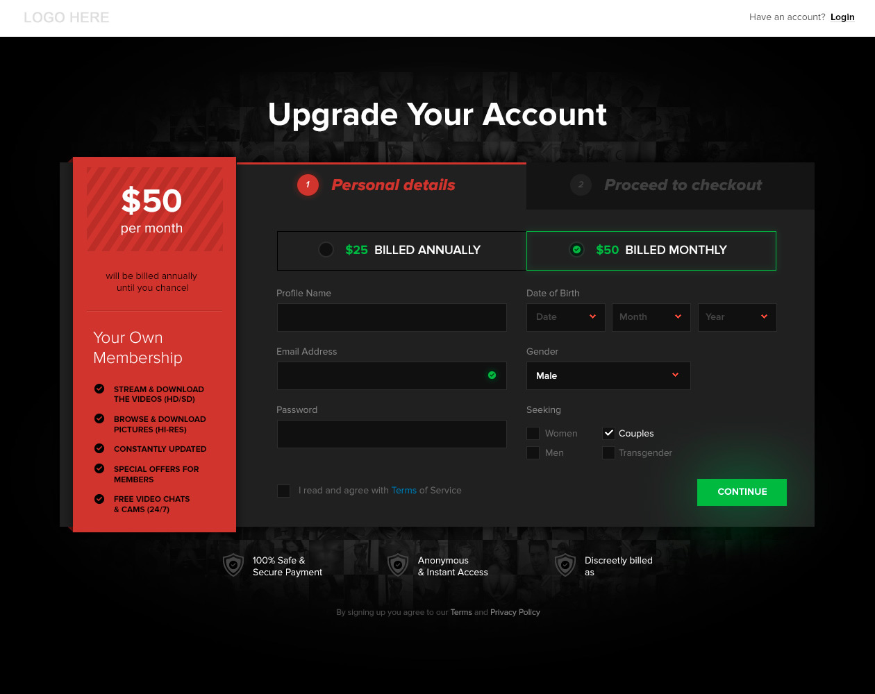 I've made the image above clickable so you can see it at full size.
__________________
Programming today is a race between software engineers striving to build bigger and better idiot-proof programs, and the Universe trying to produce bigger and better idiots. So far, the Universe is winning. |
|
|
|
|
08-13-2014, 10:38 PM
|
#41 | |
|
www.Max-Hardcore.com
Industry Role:
Join Date: Nov 2005
Posts: 1,556
|
Quote:
__________________
CCBill Affiliates Paullybadboy [@] gmail.com ICQ 631384423 |
|
|
|
|
|
08-13-2014, 11:57 PM
|
#42 | |
|
Confirmed User
Industry Role:
Join Date: Aug 2001
Location: Scotland
Posts: 2,237
|
Quote:
Yeah I noticed the numbers AFTER I exported and was hoping no one would catch that You're right though, it is just a mockup.One thing I am thinking I'll change is "Billed Annually" to "Annual Subscription" and "Monthly Subscription" .... does anyone think users are more receptive to the word subscription than billed?
__________________
Programming today is a race between software engineers striving to build bigger and better idiot-proof programs, and the Universe trying to produce bigger and better idiots. So far, the Universe is winning. |
|
|
|
|
|
08-14-2014, 12:32 AM
|
#43 | |
|
SecretFriends.com
Industry Role:
Join Date: May 2001
Location: IMC Headquarters
Posts: 27,855
|
Quote:
However only way to know how this performes is to just test it :D
__________________
WE ARE BUYING PAY SITES! CONTACT ME ClubSweethearts | ManUpFilms | SinfulXXX | HOT * AdultPrime * HOT Paying webmasters since 1996! Contact: r.riepen @ sansylgroup.com | skype:roaldr | icq: |
|
|
|
|
|
08-14-2014, 12:39 AM
|
#44 | |
|
Confirmed User

Industry Role:
Join Date: Sep 2009
Location: Radelaide
Posts: 2,157
|
Quote:
First one should ask for name, email and password. After that's done, ask for the DOB, gender and seeking. It has been proven time after time that being asked for a lot of information in one go means you're much less likely to go through with the sign up. Split the procedure and break it down: you'll cram out more conversions. |
|
|
|
|
|
08-14-2014, 01:02 AM
|
#45 | ||
|
Confirmed User
Industry Role:
Join Date: Aug 2001
Location: Scotland
Posts: 2,237
|
Quote:
Quote:
One of those versions does in fact have 3 tabs with the second one being used for DOB, gender and seeking. Another version of the page will continue to have just 2 tabs and we only ask for DOB, gender and seeking AFTER the biller has passed the user back to us on successful join. Overall, I am happy with this mockup but I can't help but feel there is still something I've missed, some text that I should or shouldn't have. Perhaps something inherently wrong with the layout. Will showing that there are actually 2 steps to the process actually turn people off? I can't say that I have seen many adult sites with a checkout style join page and maybe there's a reason for this?
__________________
Programming today is a race between software engineers striving to build bigger and better idiot-proof programs, and the Universe trying to produce bigger and better idiots. So far, the Universe is winning. |
||
|
|
|


 $30 for a $1 TRIAL


